Jason Chen is a senior designer crafting brand experiences across identity, UX/UI, and integrated creative — powered by AI thinking and a decade of real-world craft.
Bayleys
,
UXUI
,
2024
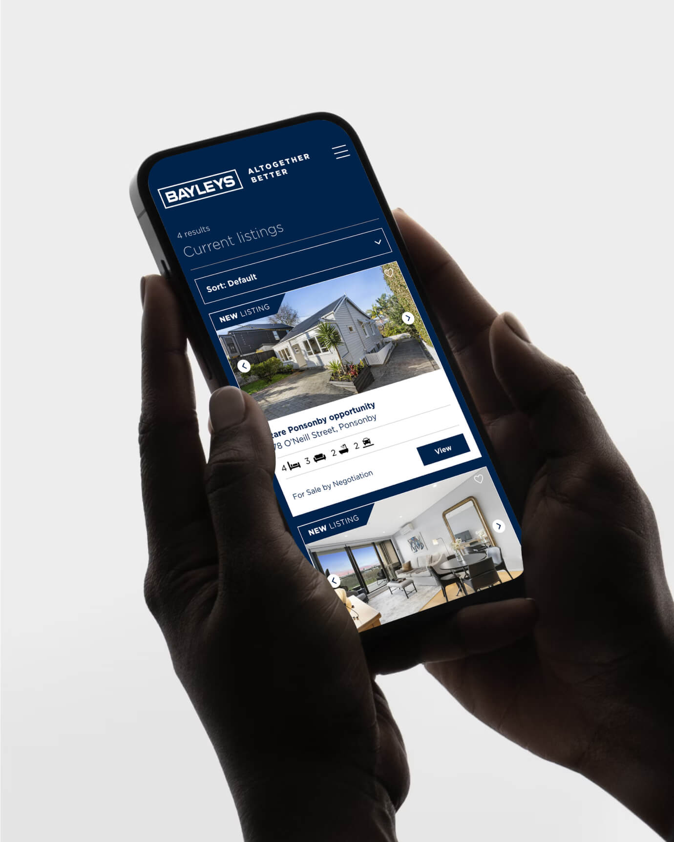
Redesigning search for New Zealand's biggest real estate brand. Bayleys is New Zealand's most recognised real estate brand — over 100 offices, thousands of listings, and buyers, sellers, and investors all trying to navigate the same digital experience. The problem wasn't the brand. It was the search. Finding the right property on a catalogue this large is the core job of the site, and it wasn't working hard enough. Developed a sophisticated design system that balanced Bayleys’ luxury aesthetic with the high-performance requirements of a fast-paced real estate engine. The 2024 website refresh helped Bayleys sell more properties by using new digital tools to bridge the price gap between buyers and sellers. These improvements boosted business confidence, leading to higher leasing rates and much faster service through award-winning technology. By providing better market data and higher-quality listings, Bayleys successfully grew from a traditional agency into a modern, data-driven property leader.

Bayleys_01
Bayleys_02

Bayleys_03

Bayleys_04

Bayleys_05
Bayleys_06

Bayleys_07
Bayleys_08

Bayleys_09

Bayleys_10
Bayleys
,
UXUI
,
2024
Redesigning search for New Zealand's biggest real estate brand. Bayleys is New Zealand's most recognised real estate brand — over 100 offices, thousands of listings, and buyers, sellers, and investors all trying to navigate the same digital experience. The problem wasn't the brand. It was the search. Finding the right property on a catalogue this large is the core job of the site, and it wasn't working hard enough. Developed a sophisticated design system that balanced Bayleys’ luxury aesthetic with the high-performance requirements of a fast-paced real estate engine. The 2024 website refresh helped Bayleys sell more properties by using new digital tools to bridge the price gap between buyers and sellers. These improvements boosted business confidence, leading to higher leasing rates and much faster service through award-winning technology. By providing better market data and higher-quality listings, Bayleys successfully grew from a traditional agency into a modern, data-driven property leader.
Bayleys_01
Bayleys_02
Bayleys_03
Bayleys_04
Bayleys_05
Bayleys_06
Bayleys_07
Bayleys_08
Bayleys_09
Bayleys_10
Glow Lab
,
UXUI
,
2024
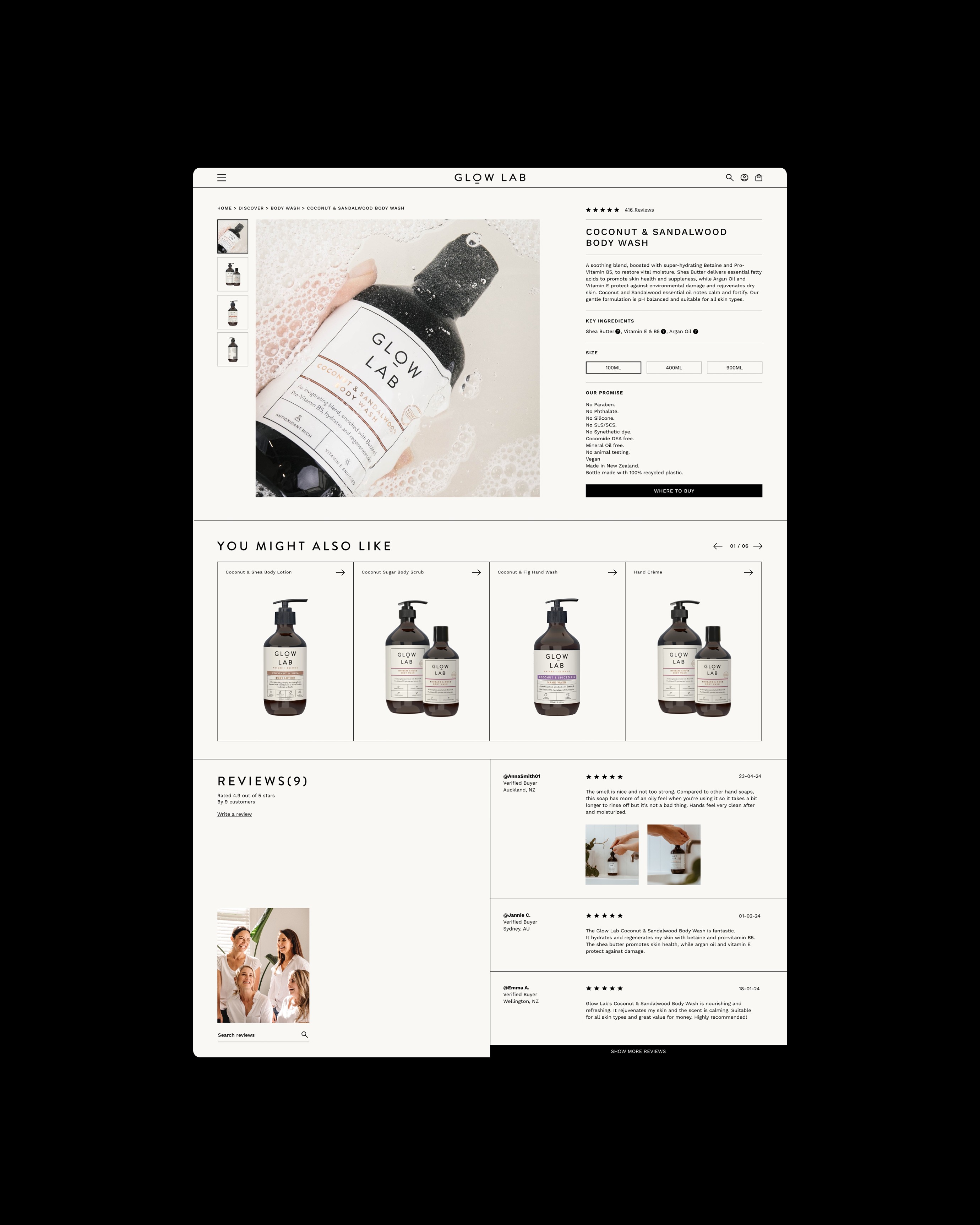
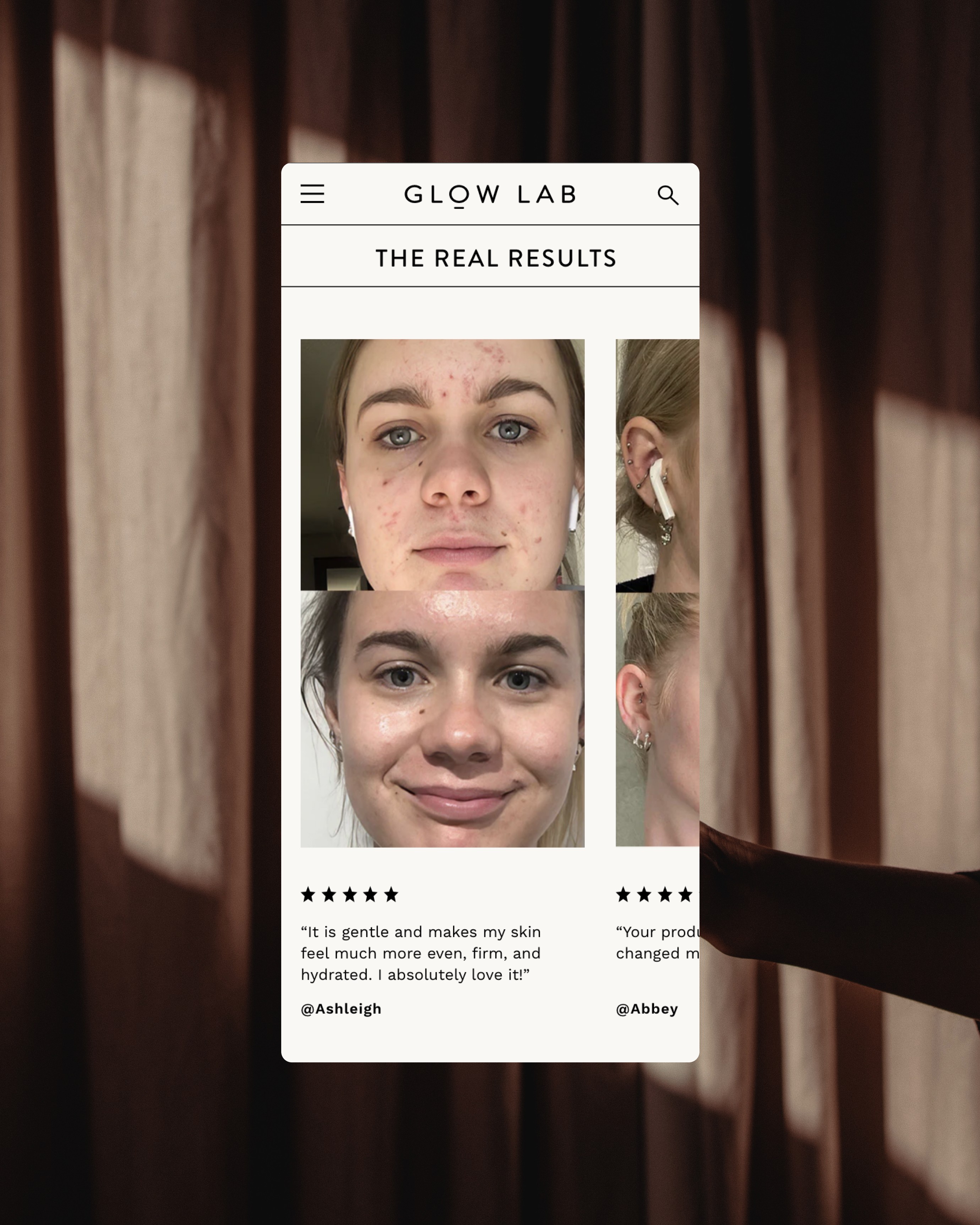
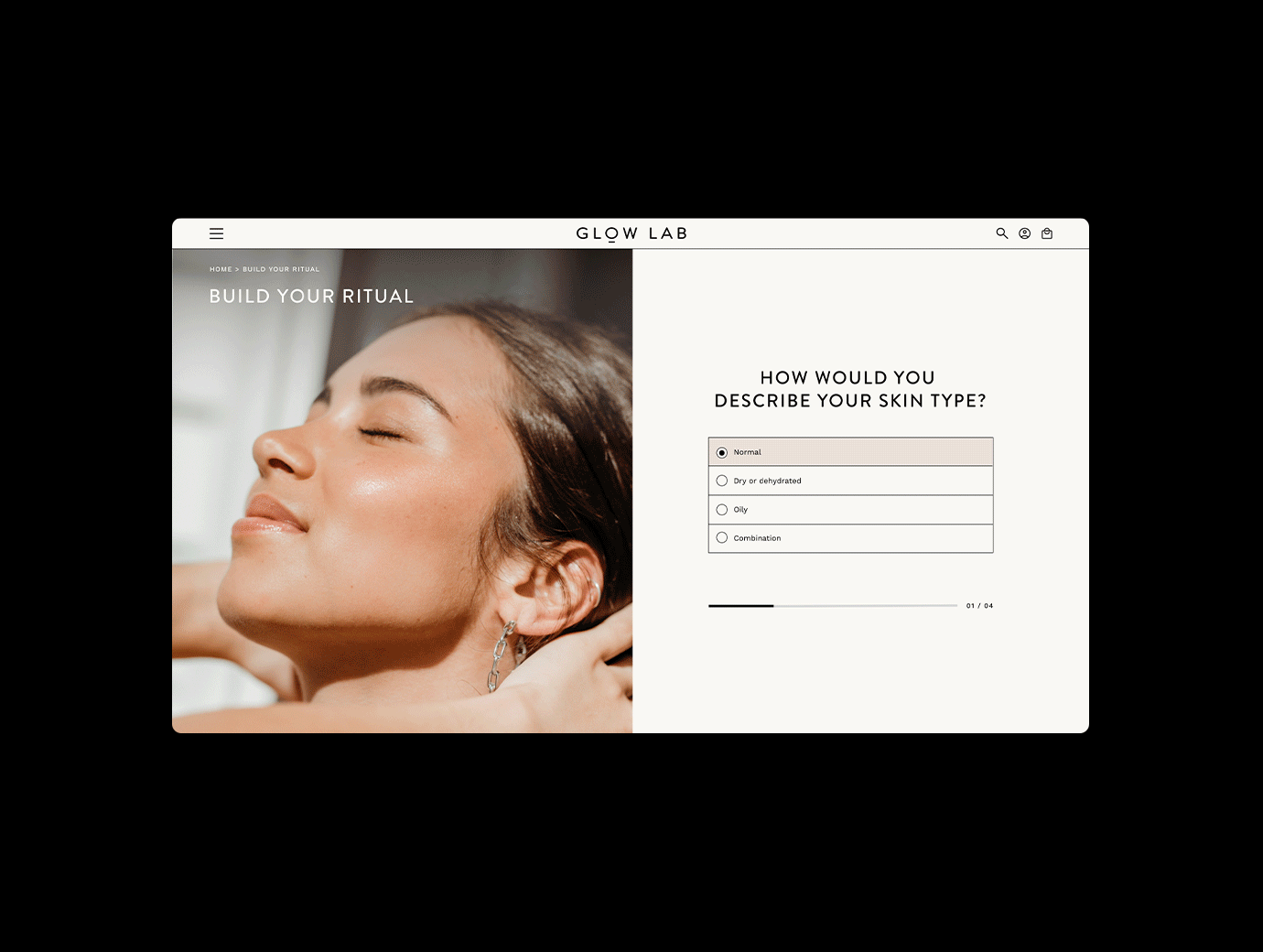
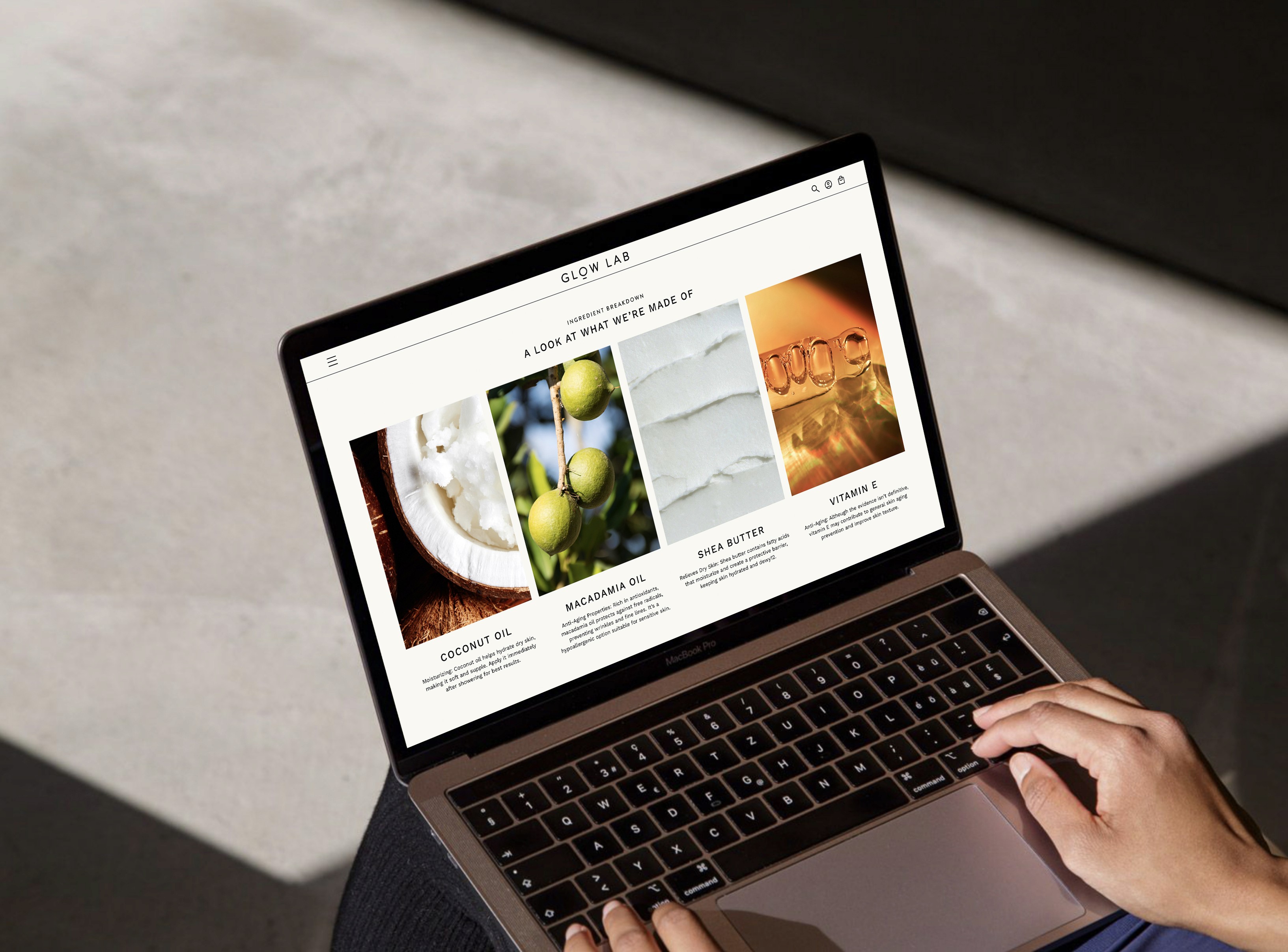
Glow Lab makes effective, science-backed skincare and haircare that shouldn't cost a fortune. The product is genuinely good. The brand has earned real loyalty. But their digital presence had fallen behind — a website that undersold the quality sitting on the shelf, making it harder for customers to discover, trust, and buy. I led the e-commerce redesign from research through to final UI, taking ownership of the UX strategy, and visual design direction — presenting the work and rationale to the client directly. The research phase focused on understanding where shoppers were dropping off and why: unclear product navigation, a content hierarchy that buried the brand's credentials, and a visual language that didn't match the confidence of the packaging. We rebuilt the experience from the ground up. The new UI made product discovery faster and more intuitive. The UI elevated the visual tone to match the brand's ambition without alienating its accessible positioning. The client's response validated the diagnosis: the redesign was recognised as a meaningful step forward for how the brand presents itself digitally, and the relationship continued well beyond the initial brief.

Glow Lab_01

Glow Lab_02
Glow Lab_03
Glow Lab_04
Glow Lab_05

Glow Lab_06
Glow Lab_07
Glow Lab_08
Glow Lab_09
Glow Lab_10
Glow Lab
,
UXUI
,
2024
Glow Lab makes effective, science-backed skincare and haircare that shouldn't cost a fortune. The product is genuinely good. The brand has earned real loyalty. But their digital presence had fallen behind — a website that undersold the quality sitting on the shelf, making it harder for customers to discover, trust, and buy. I led the e-commerce redesign from research through to final UI, taking ownership of the UX strategy, and visual design direction — presenting the work and rationale to the client directly. The research phase focused on understanding where shoppers were dropping off and why: unclear product navigation, a content hierarchy that buried the brand's credentials, and a visual language that didn't match the confidence of the packaging. We rebuilt the experience from the ground up. The new UI made product discovery faster and more intuitive. The UI elevated the visual tone to match the brand's ambition without alienating its accessible positioning. The client's response validated the diagnosis: the redesign was recognised as a meaningful step forward for how the brand presents itself digitally, and the relationship continued well beyond the initial brief.
Glow Lab_01
Glow Lab_02
Glow Lab_03
Glow Lab_04
Glow Lab_05
Glow Lab_06
Glow Lab_07
Glow Lab_08
Glow Lab_09
Glow Lab_10
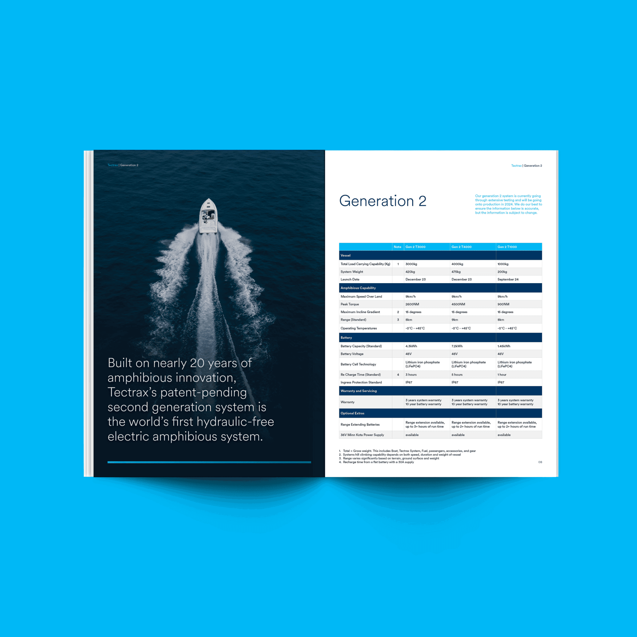
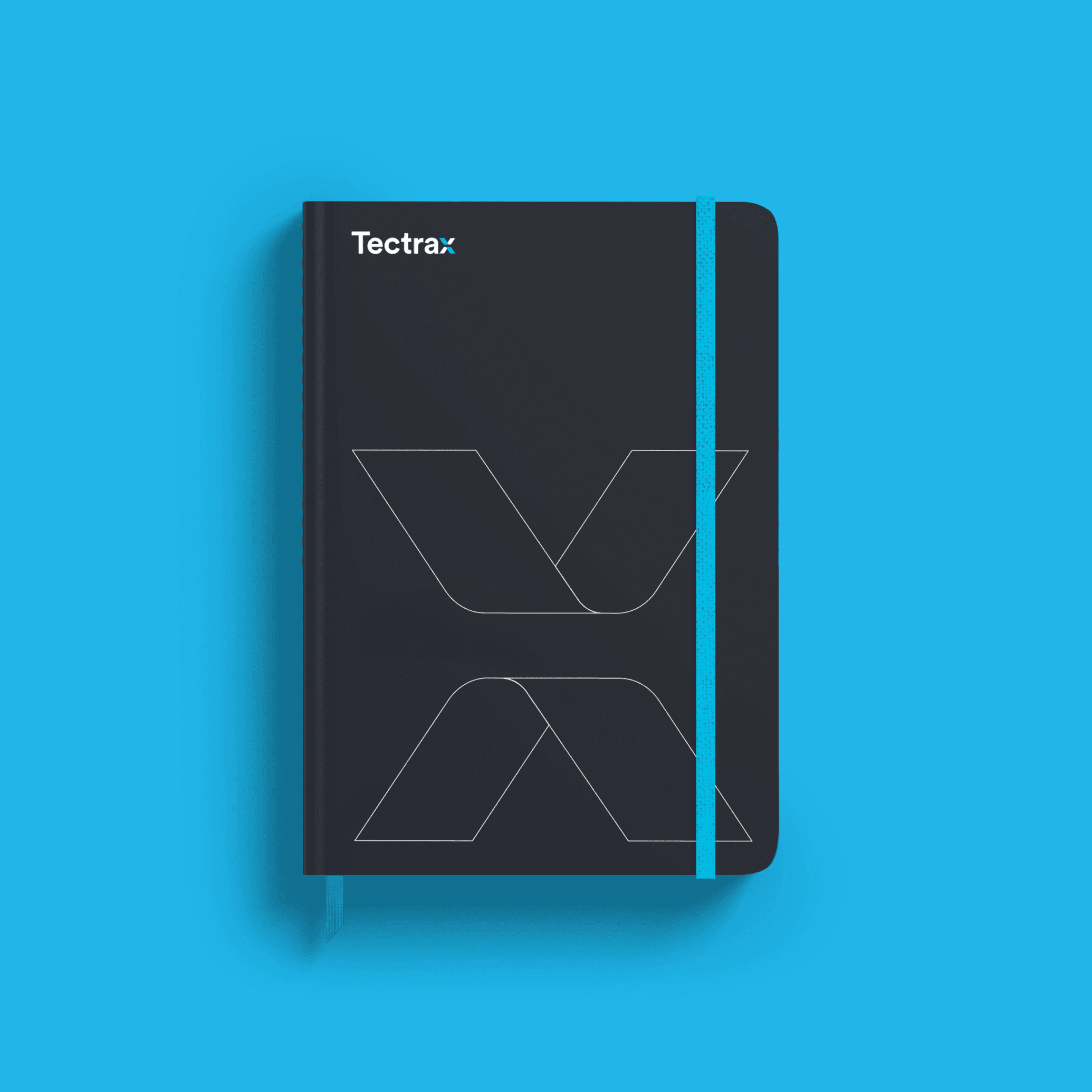
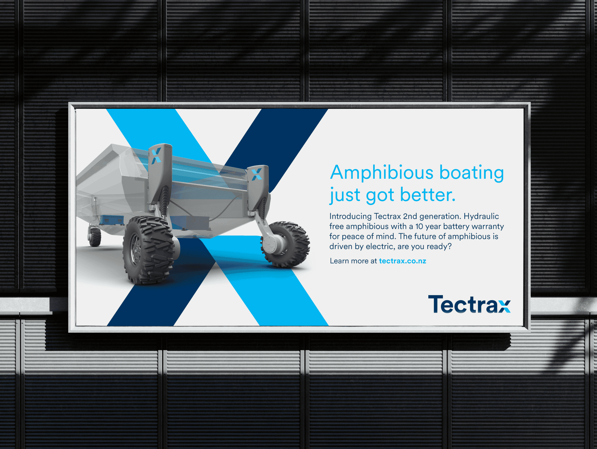
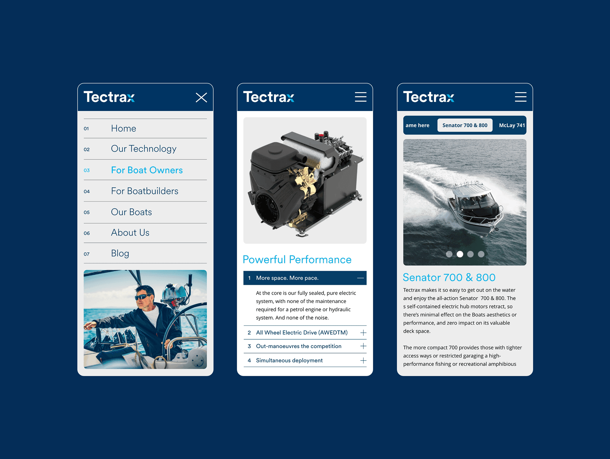
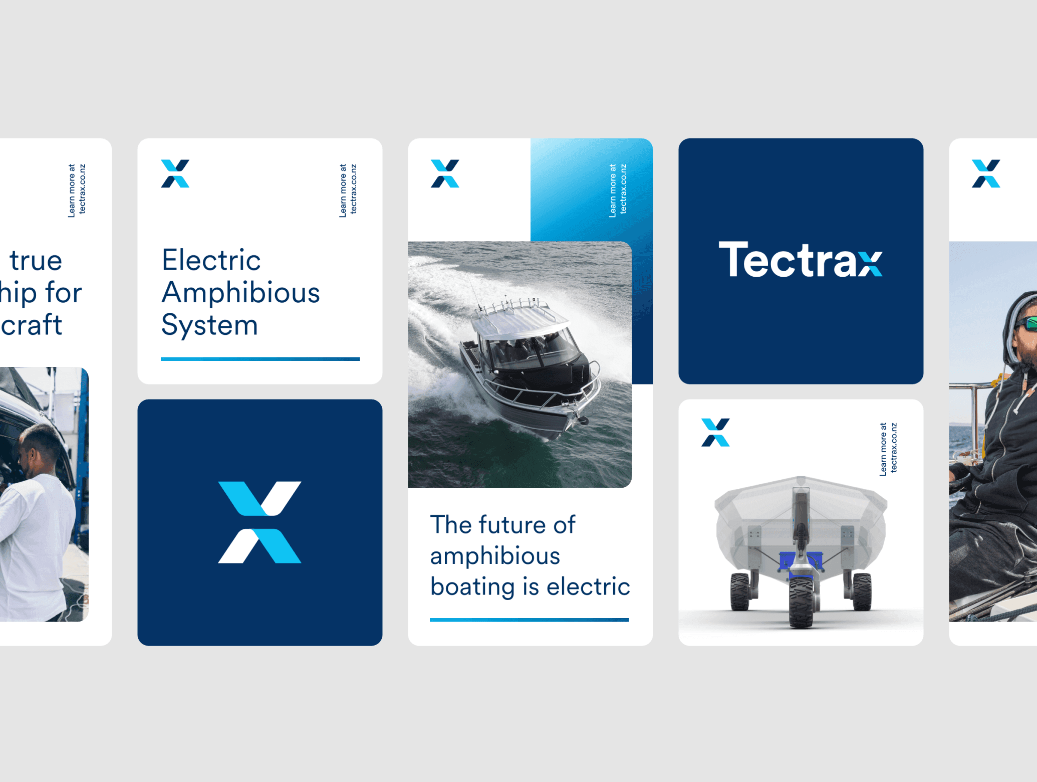
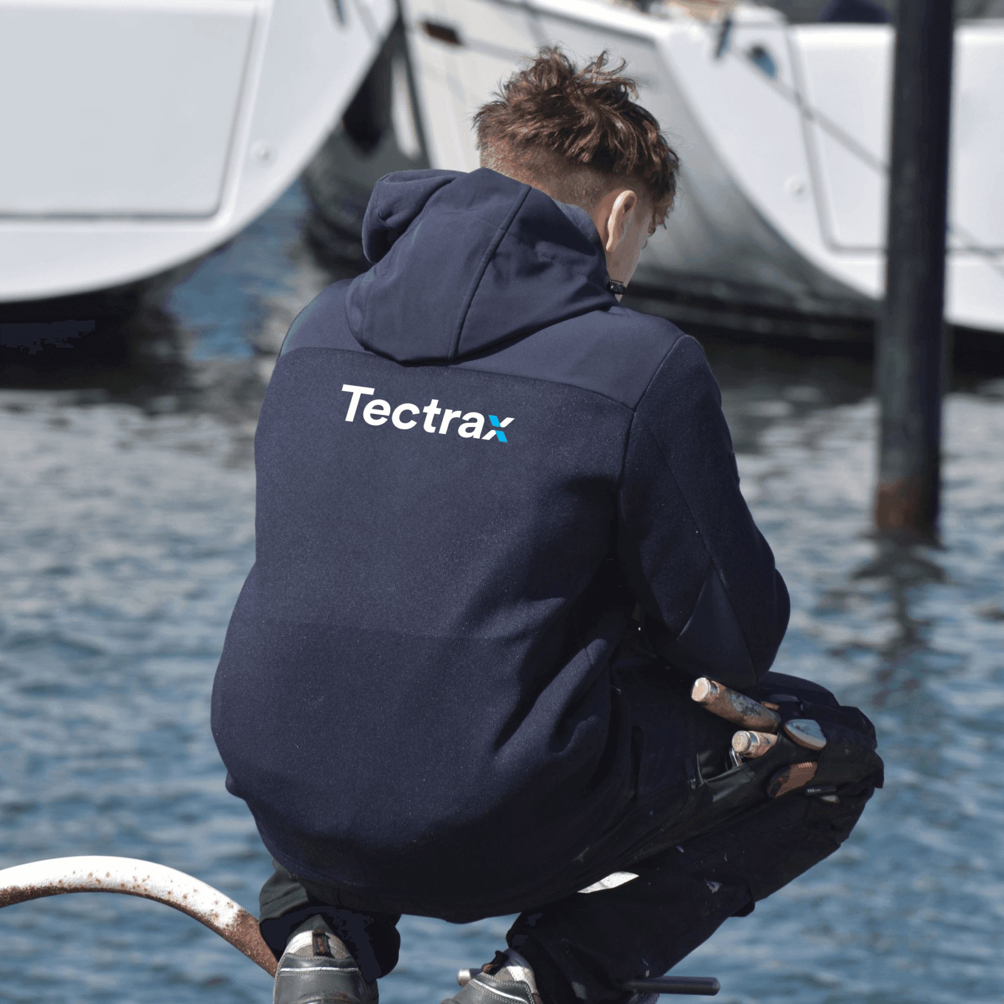
Tectrax
,
Brand Identity
,
2024
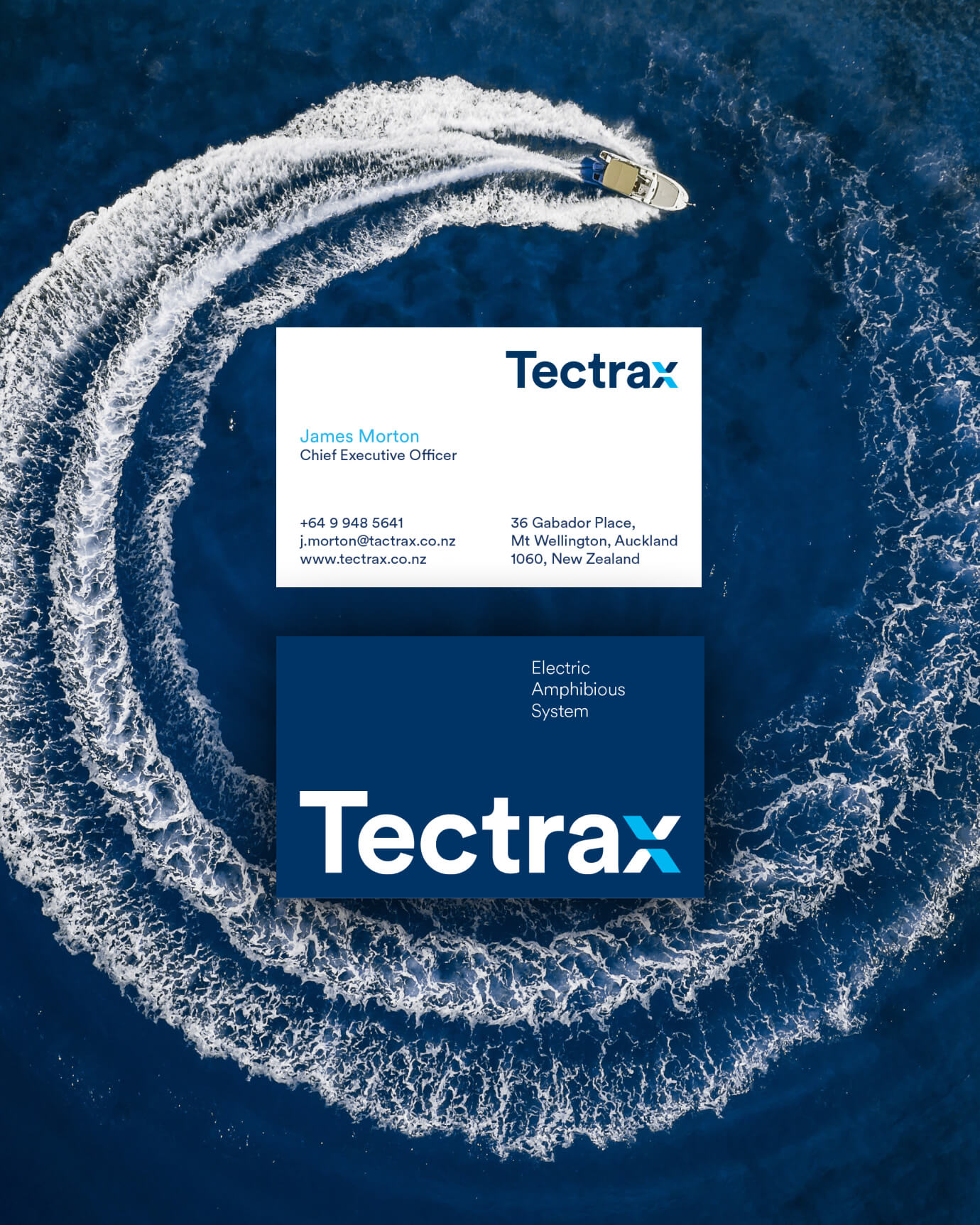
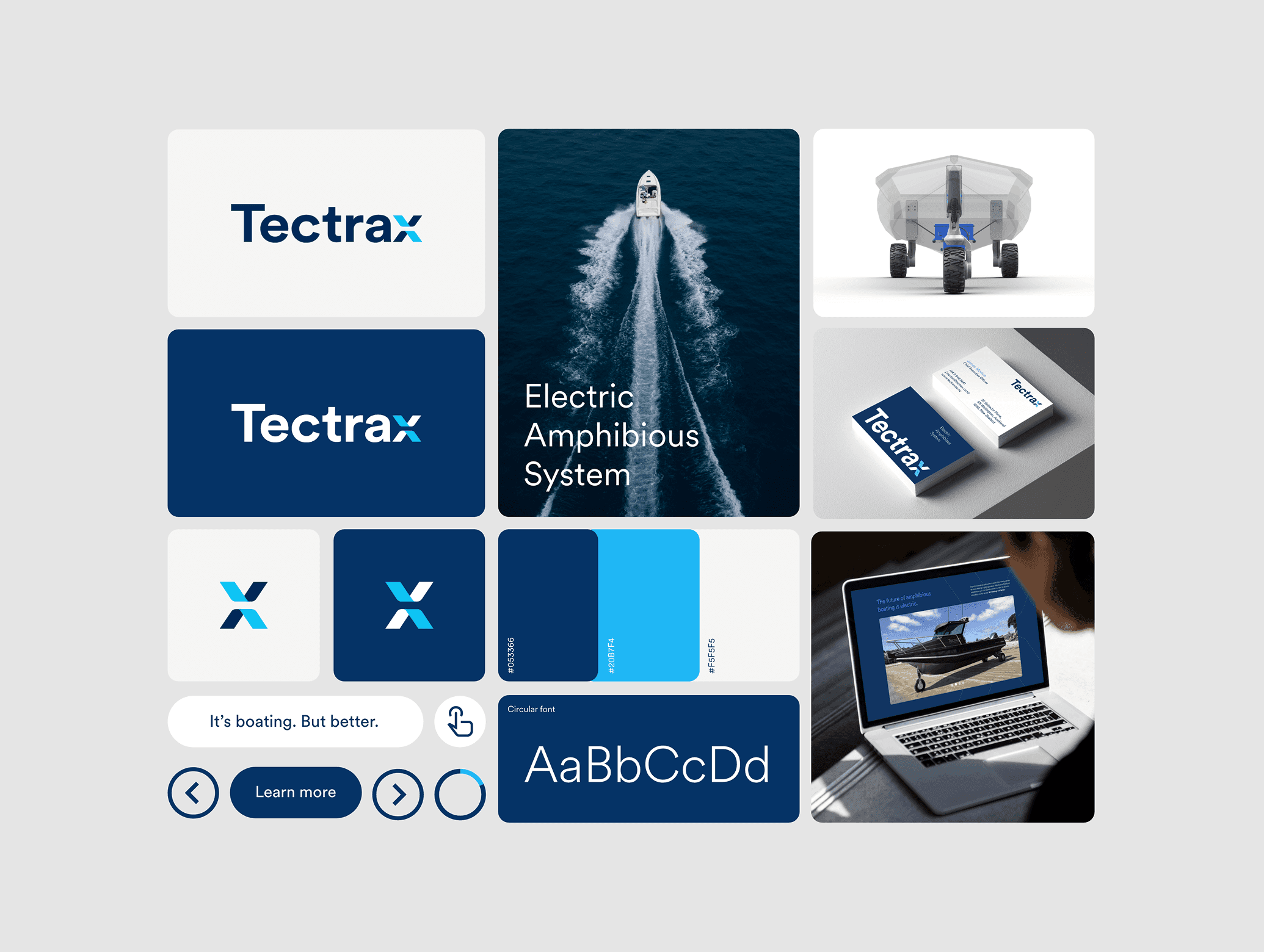
Most tech startups want a logo that looks innovative. Tectrax needed one that explained what they actually do — and did it without a diagram. They build electric amphibious systems for boats: technology that dissolves the boundary between land and water. The identity brief was to capture that in a mark that could work on a hull, a business card, and a pitch deck simultaneously. I took this from brief to final delivery, covering the full identity system, print collateral, brochure, and website. The concept lives in the X at the heart of the mark. Split in two, it carries both halves of the Tectrax story: the upper form reads as a boat hull cutting forward; the lower form represents the amphibious system beneath it. Electric blue for innovation and energy. Navy for the ocean it was built for. Together they form something that functions as a wordmark, a symbol, and a product explanation in a single gesture. The client recognised the depth of the concept immediately — a mark that gets smarter the longer you look at it, which is exactly what a technology brand that's asking investors and partners to take a leap of faith actually needs.
Tectrax_01
Tectrax_02
Tectrax_03
Tectrax_04
Tectrax_05
Tectrax_06
Tectrax_07

Tectrax_08
Tectrax_09
Tectrax_10
Tectrax_11
Tectrax
,
Brand Identity
,
2024
Most tech startups want a logo that looks innovative. Tectrax needed one that explained what they actually do — and did it without a diagram. They build electric amphibious systems for boats: technology that dissolves the boundary between land and water. The identity brief was to capture that in a mark that could work on a hull, a business card, and a pitch deck simultaneously. I took this from brief to final delivery, covering the full identity system, print collateral, brochure, and website. The concept lives in the X at the heart of the mark. Split in two, it carries both halves of the Tectrax story: the upper form reads as a boat hull cutting forward; the lower form represents the amphibious system beneath it. Electric blue for innovation and energy. Navy for the ocean it was built for. Together they form something that functions as a wordmark, a symbol, and a product explanation in a single gesture. The client recognised the depth of the concept immediately — a mark that gets smarter the longer you look at it, which is exactly what a technology brand that's asking investors and partners to take a leap of faith actually needs.
Tectrax_01
Tectrax_02
Tectrax_03
Tectrax_04
Tectrax_05
Tectrax_06
Tectrax_07
Tectrax_08
Tectrax_09
Tectrax_10
Tectrax_11
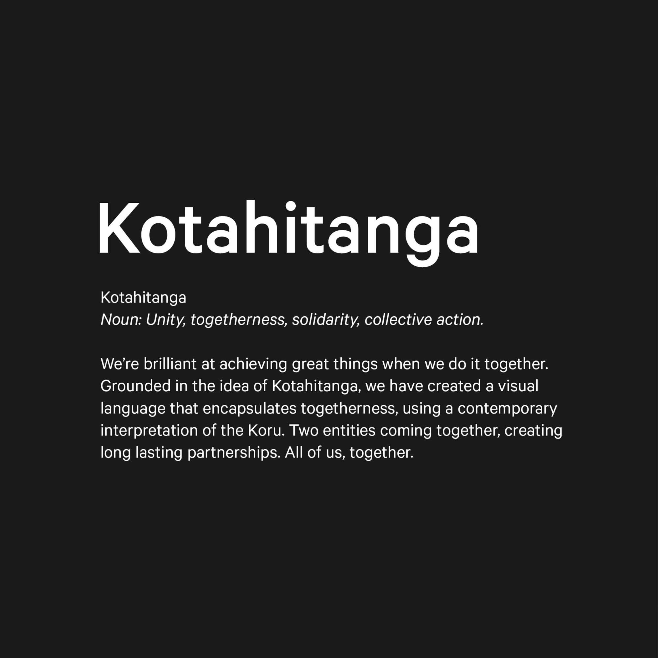
Unity Money
,
Brand Identity
,
2024
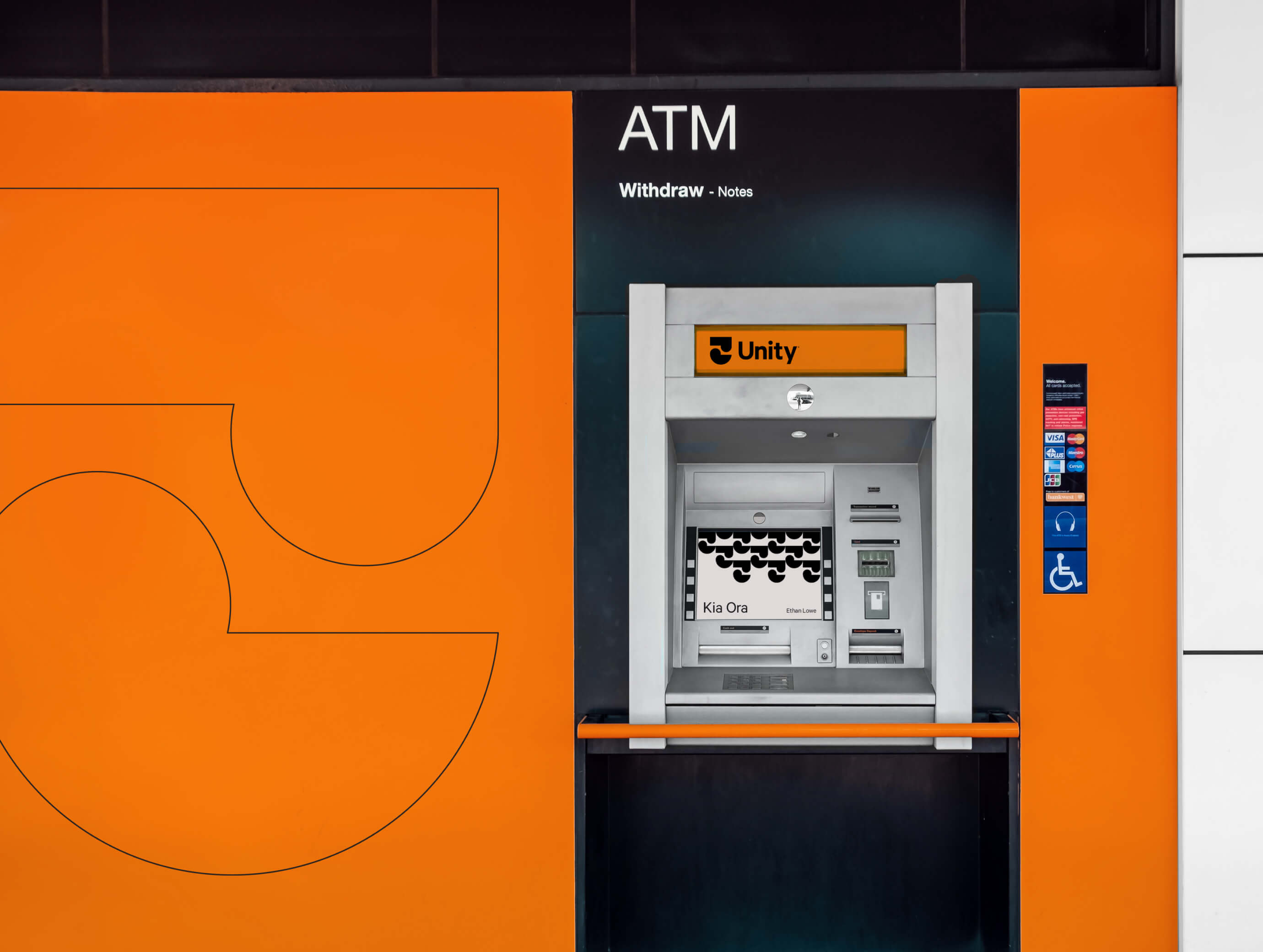
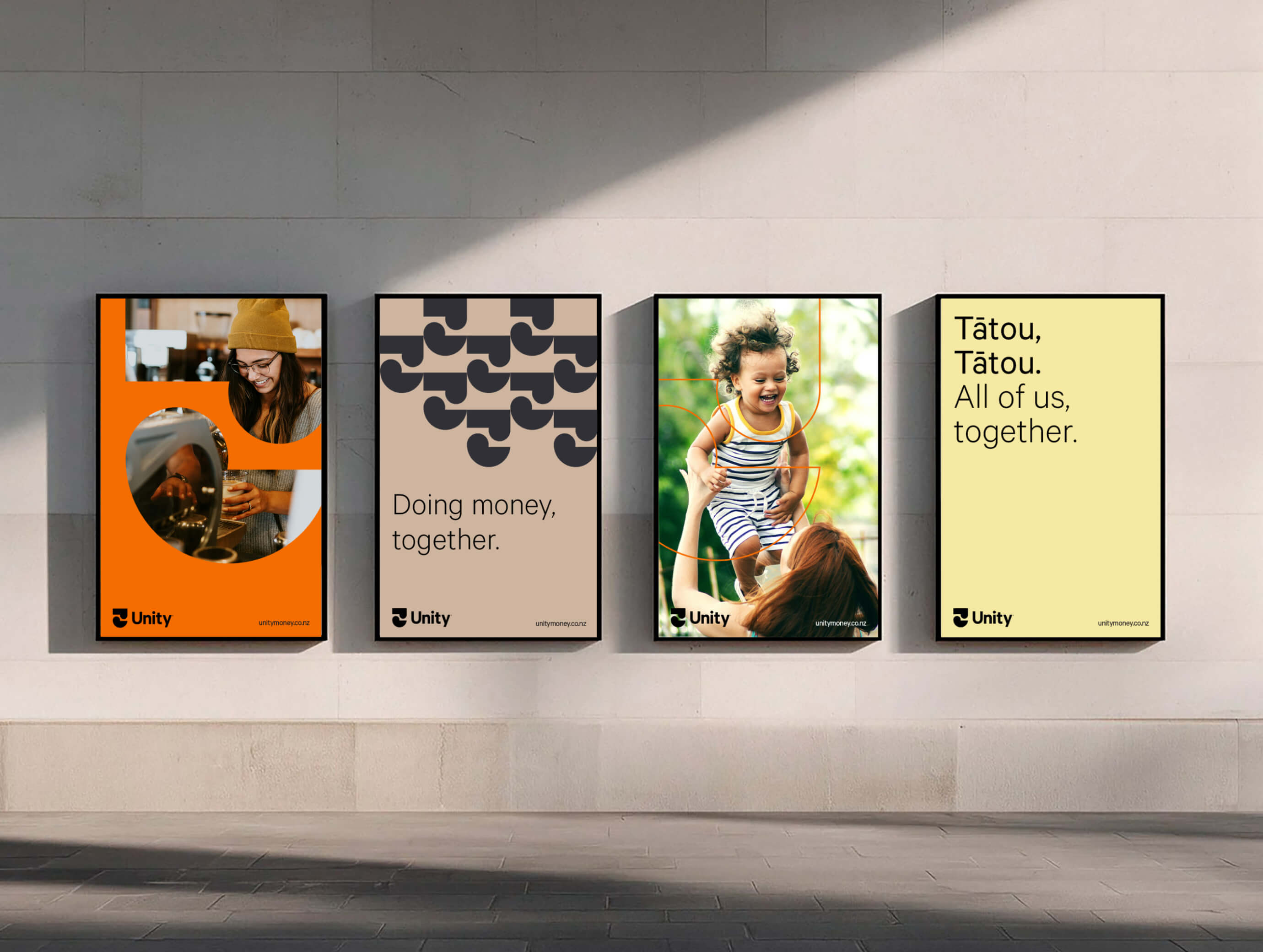
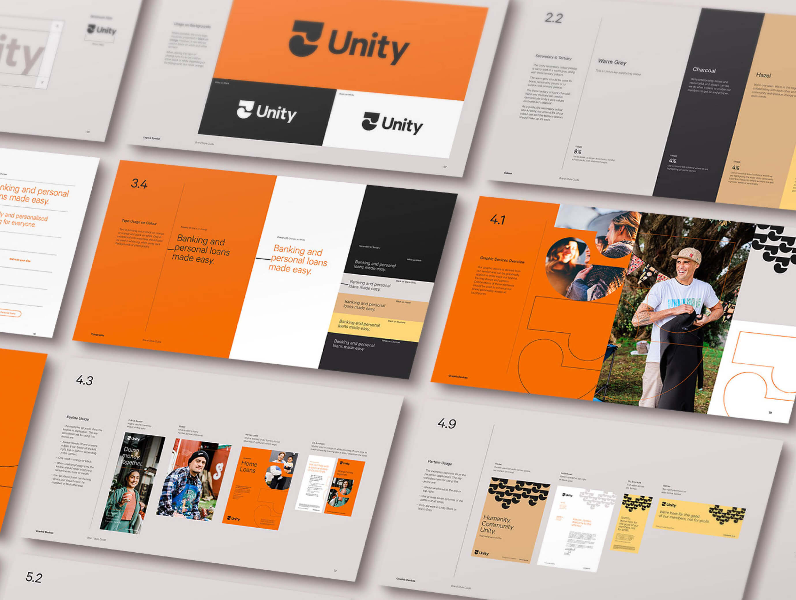
Unity Money is a member-owned New Zealand credit union with a genuinely different philosophy: that doing money together is better than doing it alone. When they came to rebrand, the challenge wasn't just visual — it was conceptual. How do you express collective ownership and mutual benefit through a brand identity without it feeling generic, corporate, or hollow? Working alongside Culture & Theory, I contributed to the brand identity and website design, with my focus on the visual language and identity system. The creative foundation the team landed on was Kotahitanga — the Māori concept of unity, togetherness, and collective action. From this, we developed a visual system centred on a contemporary interpretation of the Koru: two forms coming together to create something neither could be alone. It gave the brand a mark with genuine cultural grounding and conceptual integrity, not decoration layered over an existing idea. Since the late 2024 launch, Unity Money has scaled to 60,000 members through a unified national identity. An SEO-driven strategy fueled a 237% surge in organic traffic, outranking major banks for key lending terms. Consolidating operations boosted support capacity by 17%, shifting the model toward digital-first accessibility.

Unity_01
Unity_02

Unity_03

Unity_04

Unity_05

Unity_06

Unity_07
Unity_08
Unity_09

Unity_10
Unity_11
Unity Money
,
Brand Identity
,
2024
Unity Money is a member-owned New Zealand credit union with a genuinely different philosophy: that doing money together is better than doing it alone. When they came to rebrand, the challenge wasn't just visual — it was conceptual. How do you express collective ownership and mutual benefit through a brand identity without it feeling generic, corporate, or hollow? Working alongside Culture & Theory, I contributed to the brand identity and website design, with my focus on the visual language and identity system. The creative foundation the team landed on was Kotahitanga — the Māori concept of unity, togetherness, and collective action. From this, we developed a visual system centred on a contemporary interpretation of the Koru: two forms coming together to create something neither could be alone. It gave the brand a mark with genuine cultural grounding and conceptual integrity, not decoration layered over an existing idea. Since the late 2024 launch, Unity Money has scaled to 60,000 members through a unified national identity. An SEO-driven strategy fueled a 237% surge in organic traffic, outranking major banks for key lending terms. Consolidating operations boosted support capacity by 17%, shifting the model toward digital-first accessibility.
Unity_01
Unity_02
Unity_03
Unity_04
Unity_05
Unity_06
Unity_07
Unity_08
Unity_09
Unity_10
Unity_11
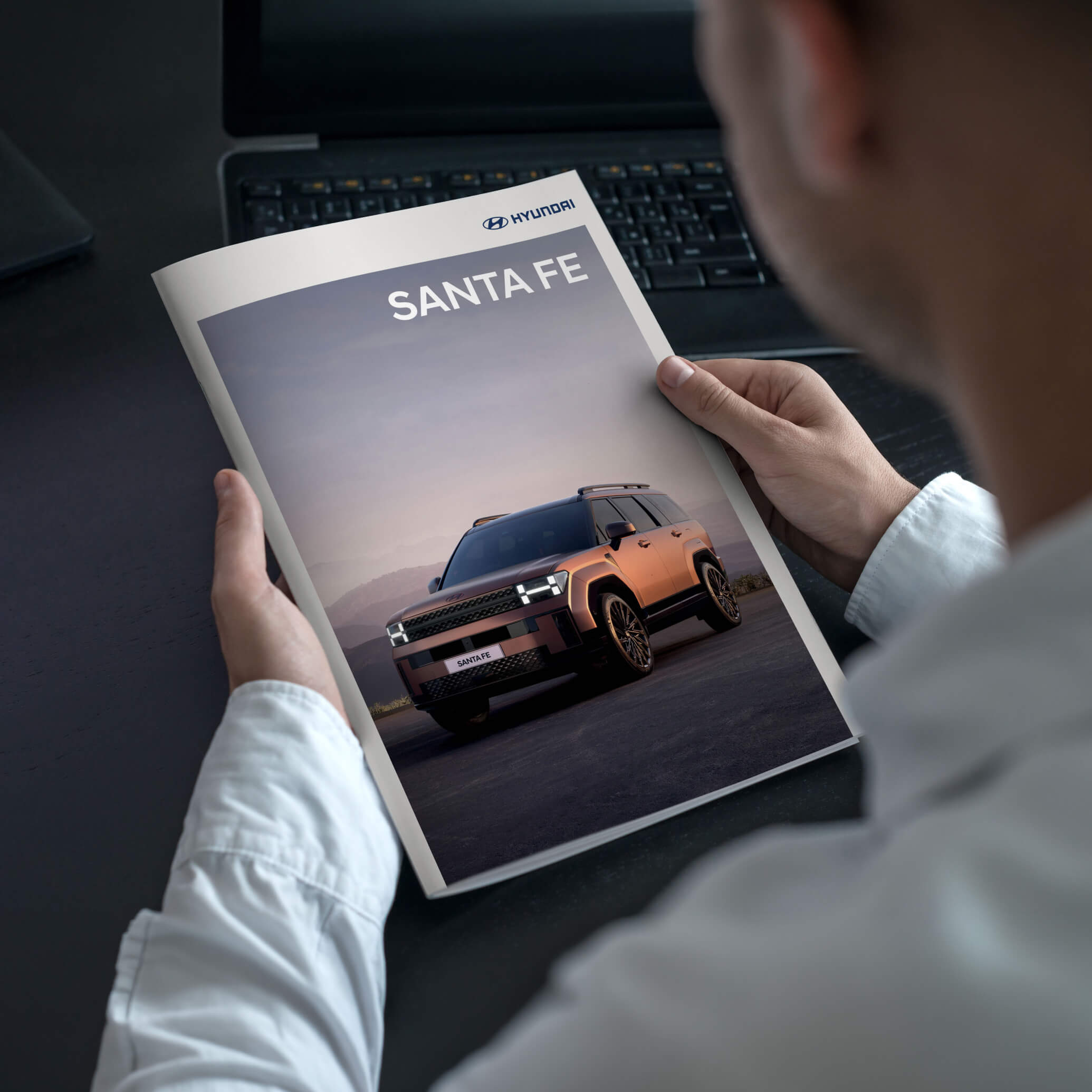
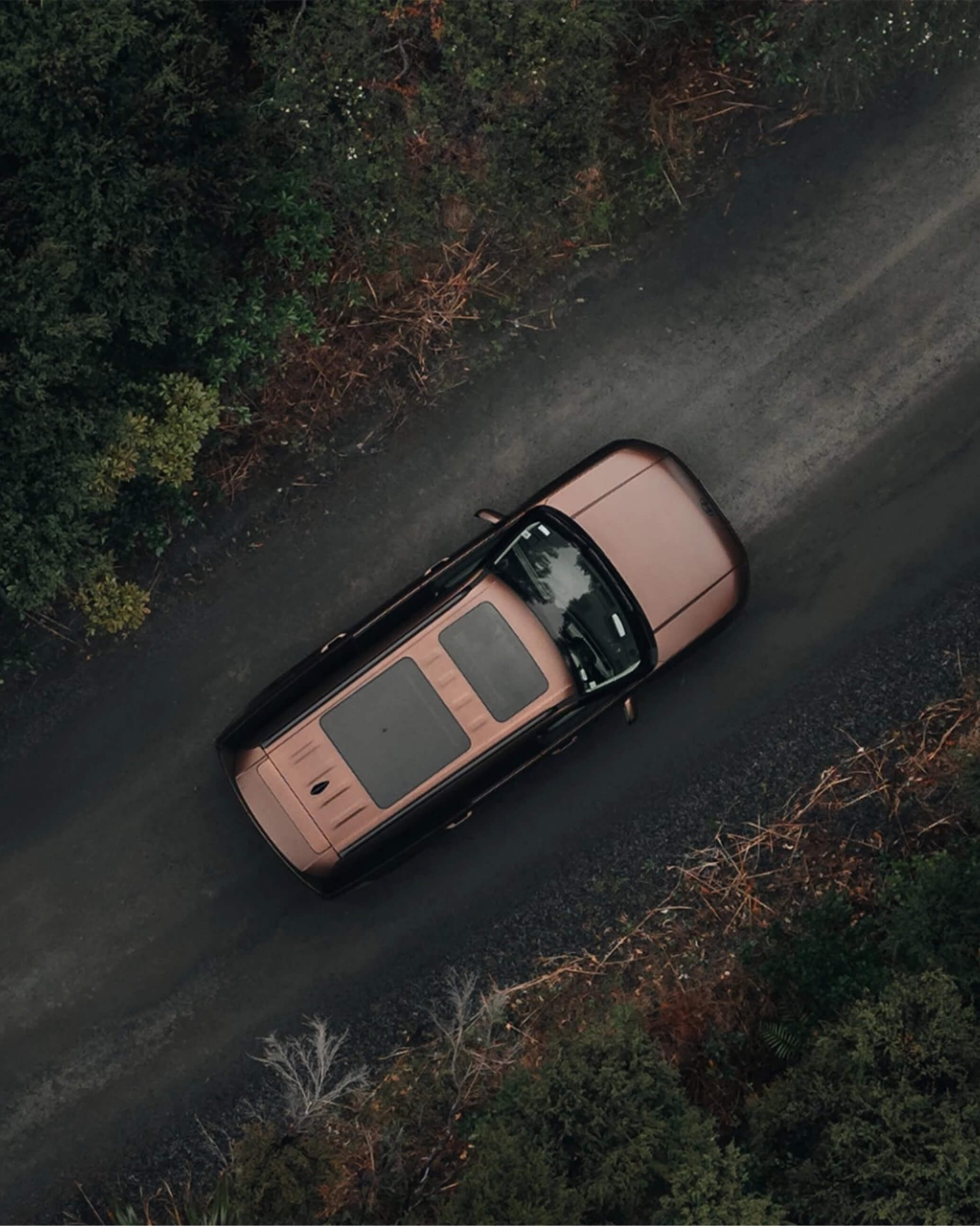
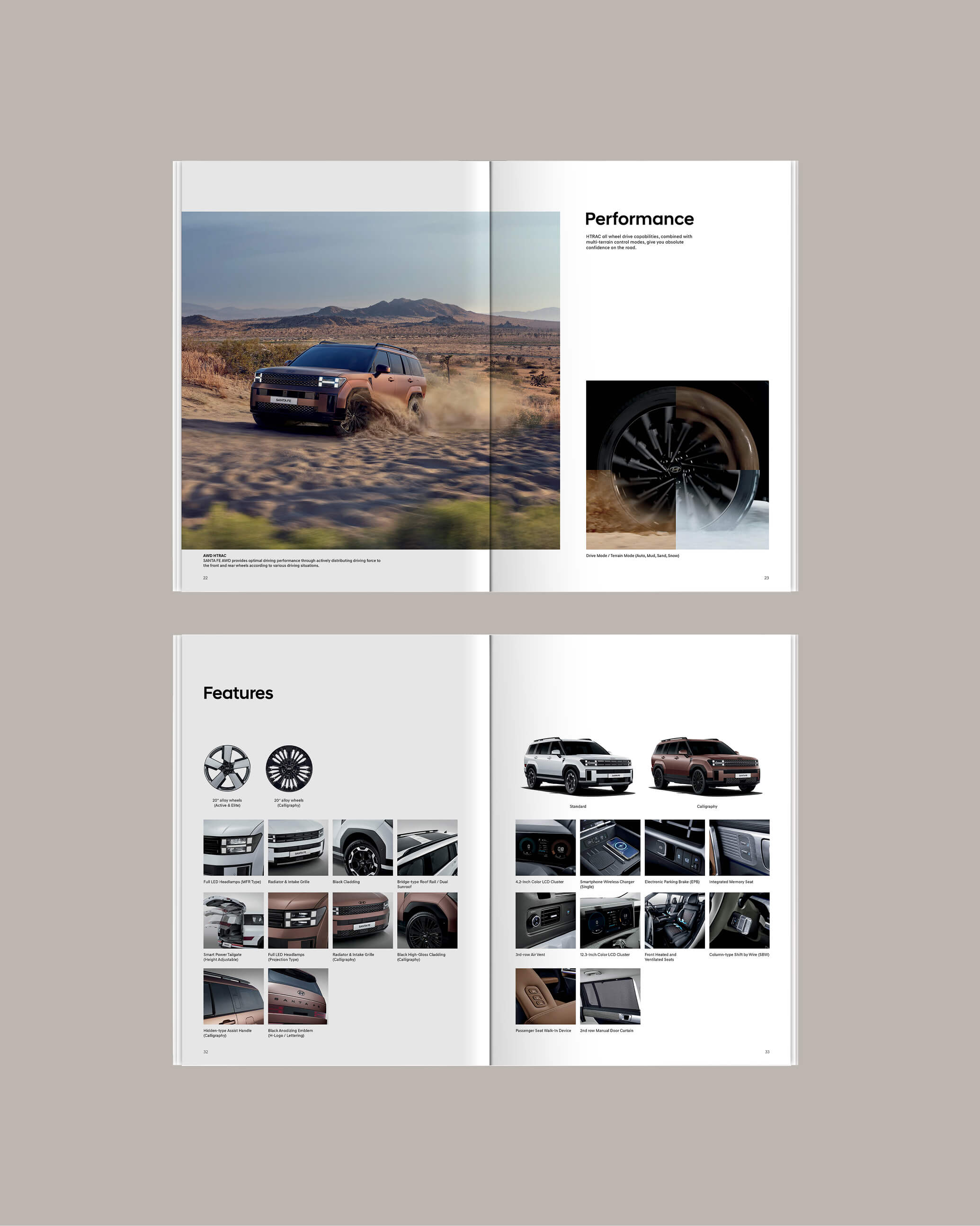
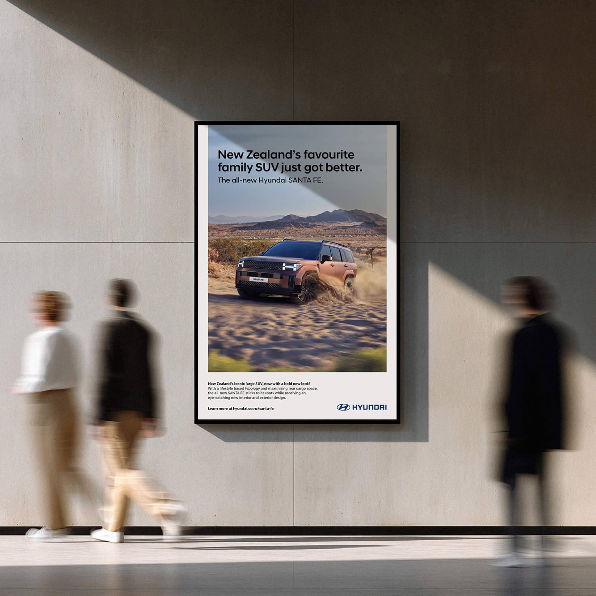
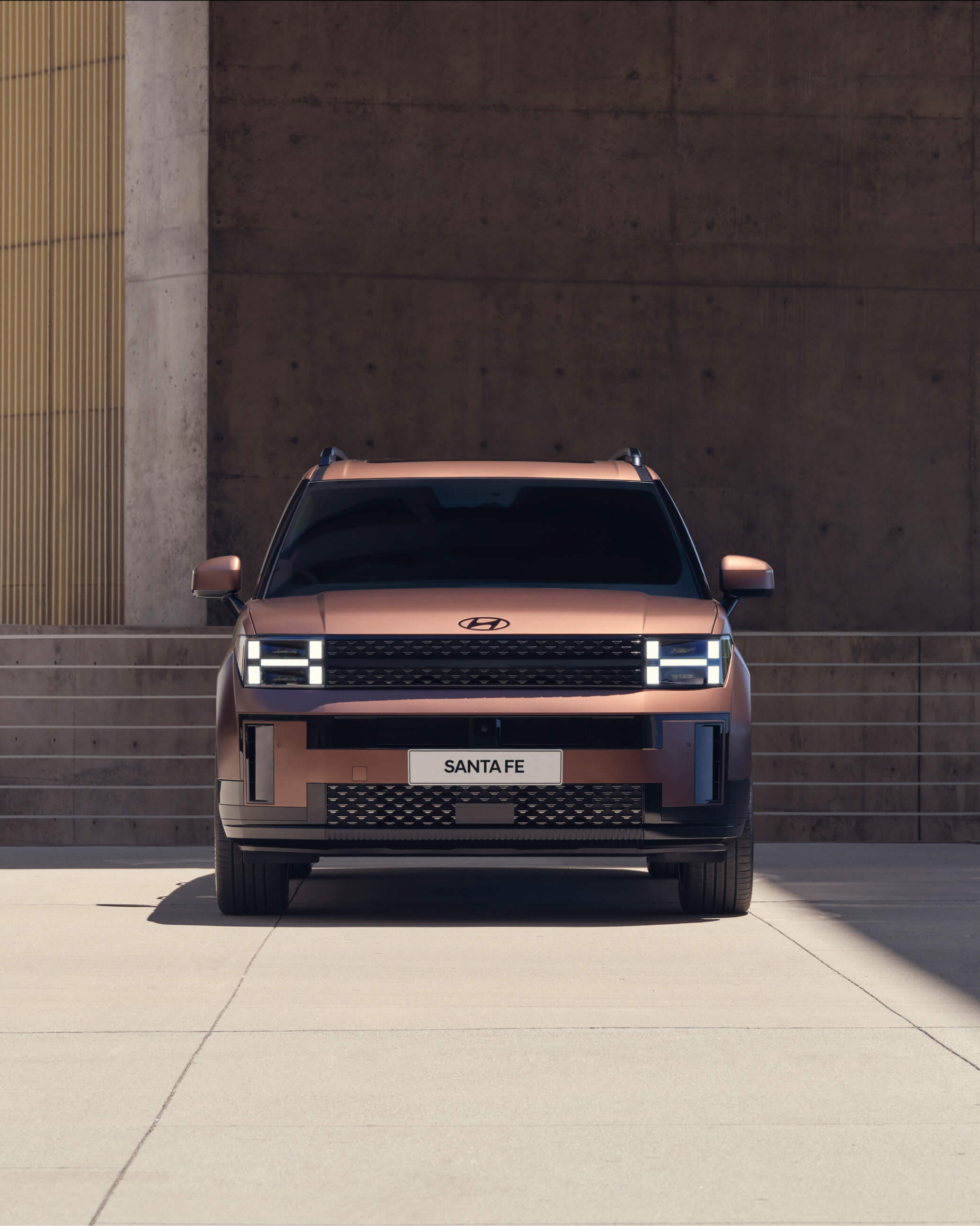
Hyundai
,
Advertising
,
2024
Over 26,000 Santa Fes sold in New Zealand since 2000. A vehicle that's earned its place in the driveways, school runs, and road trips of a generation of Kiwi families. So when the fifth generation arrived — bolder in design, hybrid-only for the first time, and unambiguously premium in its ambitions — it needed a launch that respected that history while announcing a real step forward. As brand guardian for Hyundai New Zealand, I led the creative direction across the full launch ecosystem. That meant taking responsibility for a wide range of deliverables — brochures, billboard creative, website content, in-store displays, and nationwide dealership support materials — while coordinating with copywriters and production partners on specific executions to ensure every touchpoint held the same creative standard. The campaign supported the Santa Fe's transition into the hybrid-dominant market, contributing to the model maintaining a Top 10 sales position despite a 20% contraction in the overall NZ automotive industry.
Hyundai_01
Hyundai_02
Hyundai_03
Hyundai_04
Hyundai_05
Hyundai_06
Hyundai_07

Hyundai_08
Hyundai
,
Advertising
,
2024
Over 26,000 Santa Fes sold in New Zealand since 2000. A vehicle that's earned its place in the driveways, school runs, and road trips of a generation of Kiwi families. So when the fifth generation arrived — bolder in design, hybrid-only for the first time, and unambiguously premium in its ambitions — it needed a launch that respected that history while announcing a real step forward. As brand guardian for Hyundai New Zealand, I led the creative direction across the full launch ecosystem. That meant taking responsibility for a wide range of deliverables — brochures, billboard creative, website content, in-store displays, and nationwide dealership support materials — while coordinating with copywriters and production partners on specific executions to ensure every touchpoint held the same creative standard. The campaign supported the Santa Fe's transition into the hybrid-dominant market, contributing to the model maintaining a Top 10 sales position despite a 20% contraction in the overall NZ automotive industry.
Hyundai_01
Hyundai_02
Hyundai_03
Hyundai_04
Hyundai_05
Hyundai_06
Hyundai_07
Hyundai_08
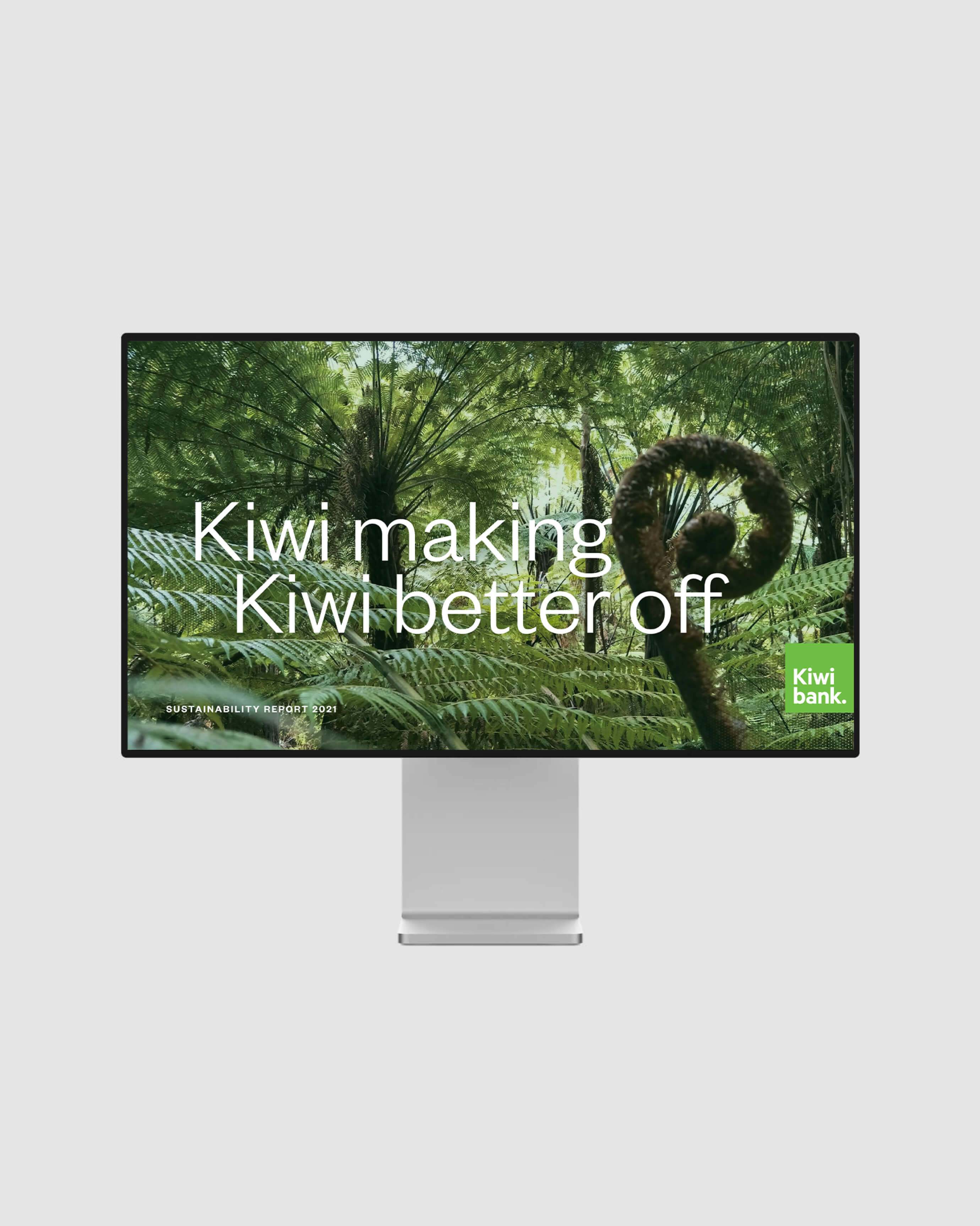
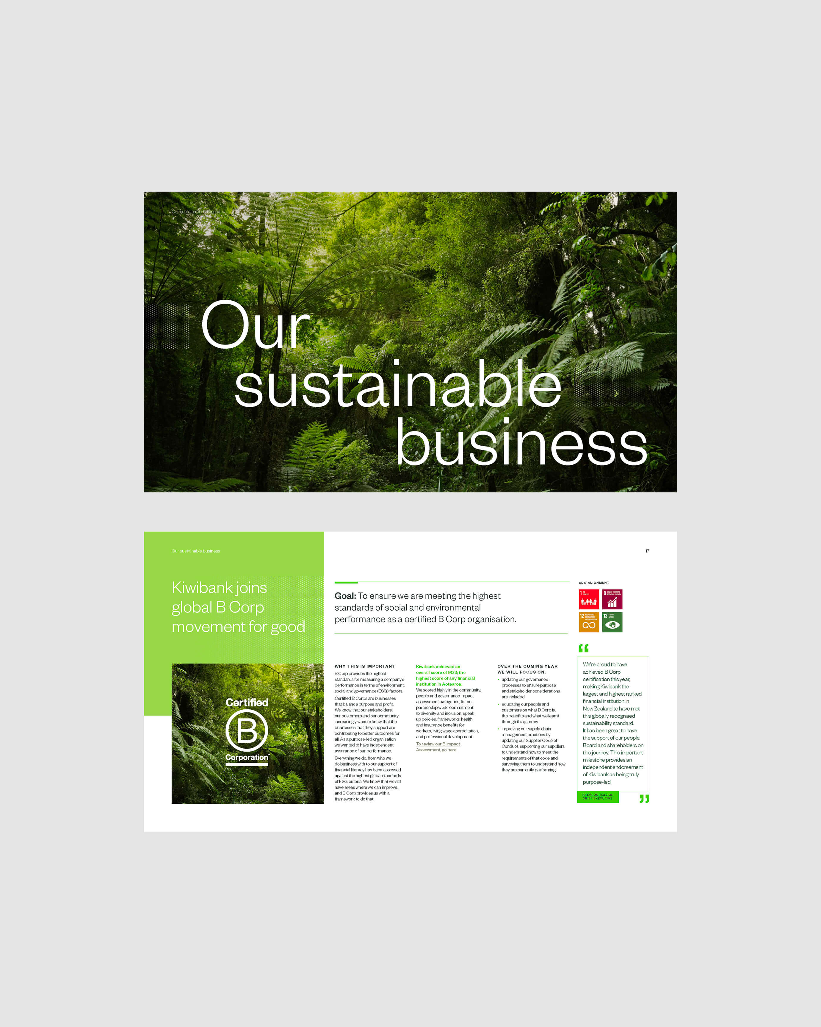
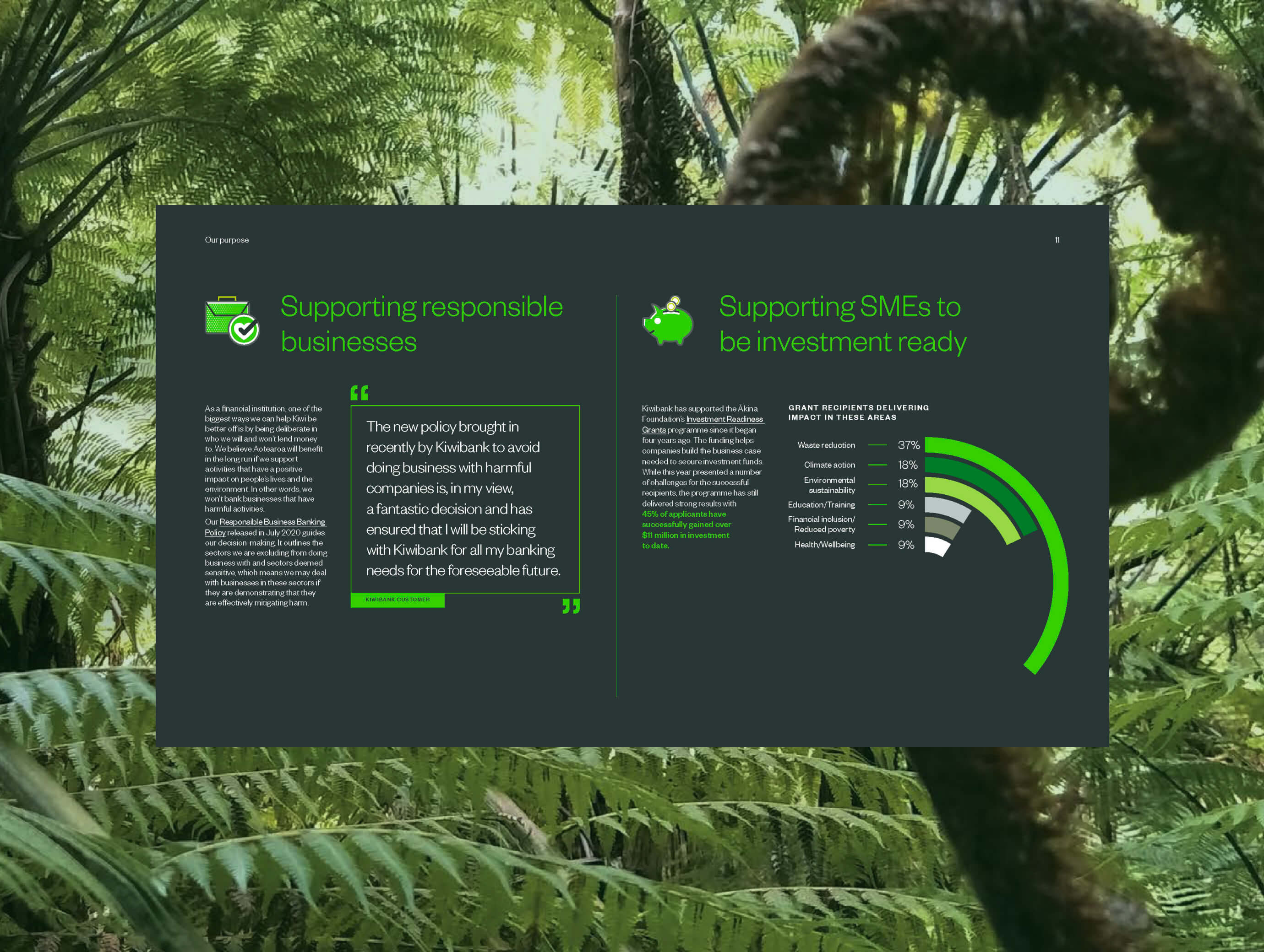
Kiwi Bank
,
Sustainability Report
,
2021
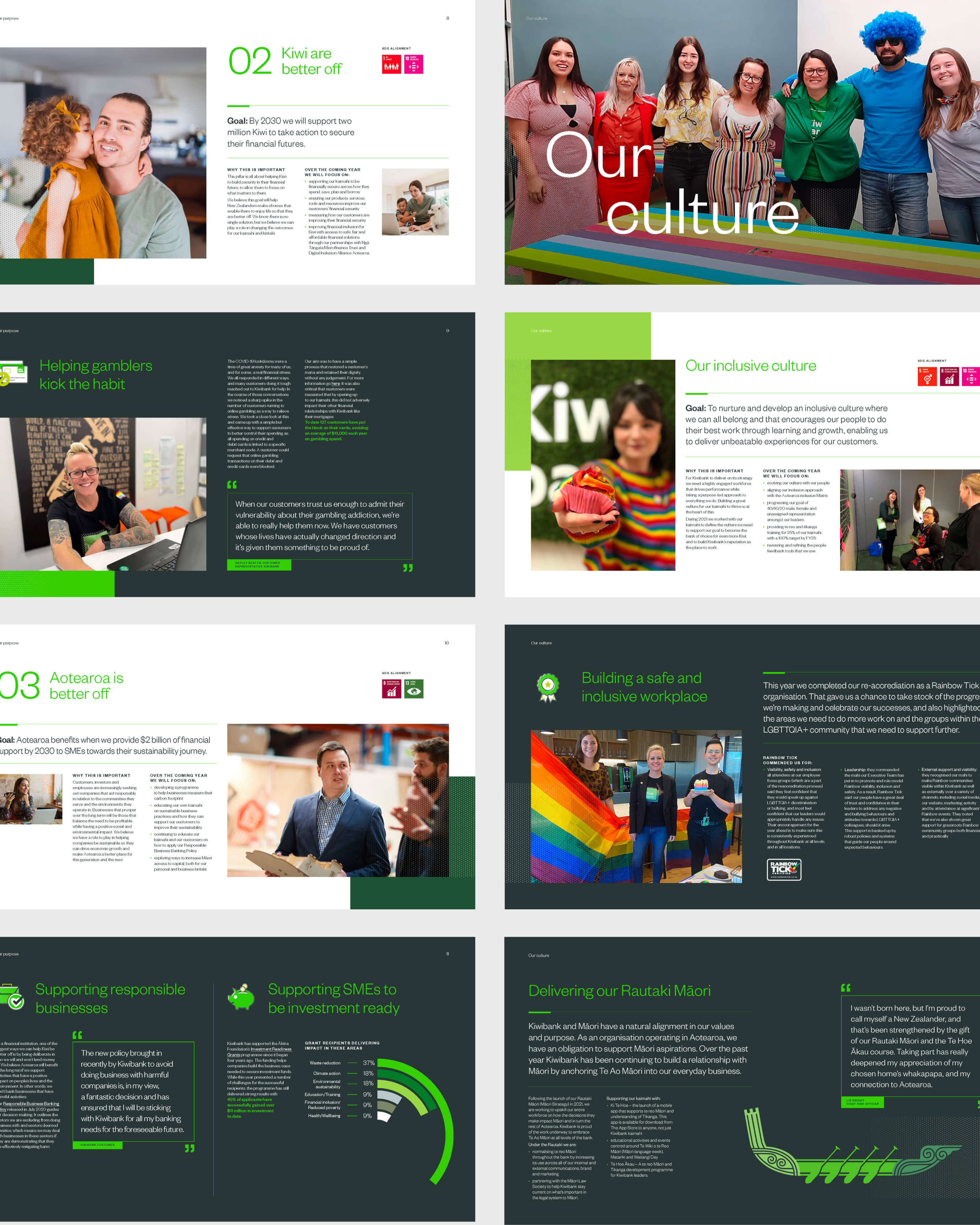
Working alongside Principals, I designed the report template and layout system — building a visual framework capable of carrying significant content across people, communities, climate, and the economy with clarity and confidence. The challenge was dual: create something that felt unmistakably Kiwibank, while also feeling worthy of the occasion. A landmark document needs to look like one. The resulting framework balanced typographic rigour with visual warmth, giving editors a system that scaled across the full report without losing coherence. The report launched as Kiwibank's first public statement of purpose — and the design was recognised by the client as achieving the tone and authority the moment demanded.

Kiwi Bank_01
Kiwi Bank_02

Kiwi Bank_03

Kiwi Bank_04
Kiwi Bank_05

Kiwi Bank_06
Kiwi Bank_07
Kiwi Bank_08
Kiwi Bank
,
Sustainability Report
,
2021
Working alongside Principals, I designed the report template and layout system — building a visual framework capable of carrying significant content across people, communities, climate, and the economy with clarity and confidence. The challenge was dual: create something that felt unmistakably Kiwibank, while also feeling worthy of the occasion. A landmark document needs to look like one. The resulting framework balanced typographic rigour with visual warmth, giving editors a system that scaled across the full report without losing coherence. The report launched as Kiwibank's first public statement of purpose — and the design was recognised by the client as achieving the tone and authority the moment demanded.
Kiwi Bank_01
Kiwi Bank_02
Kiwi Bank_03
Kiwi Bank_04
Kiwi Bank_05
Kiwi Bank_06
Kiwi Bank_07
Kiwi Bank_08
Invest Queenstown
,
Brand
,
2024
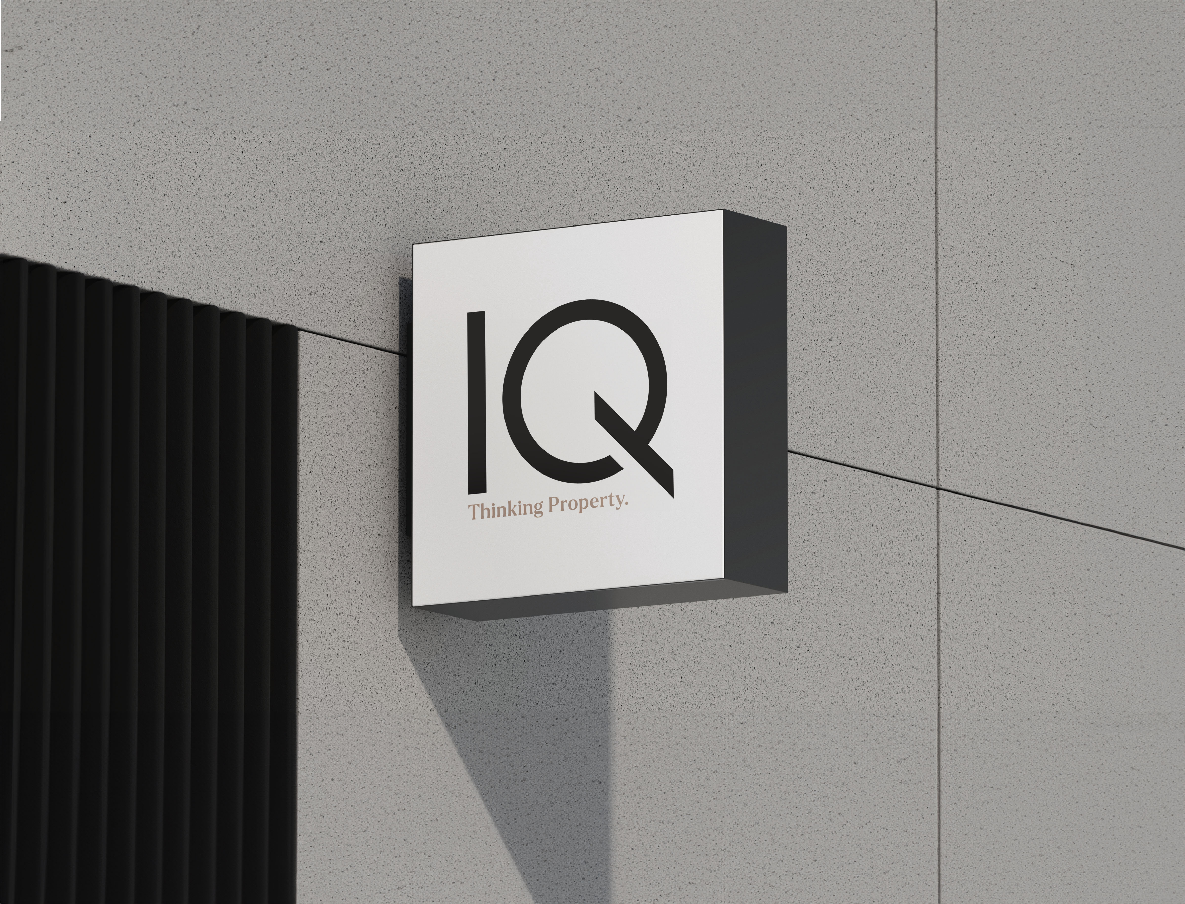
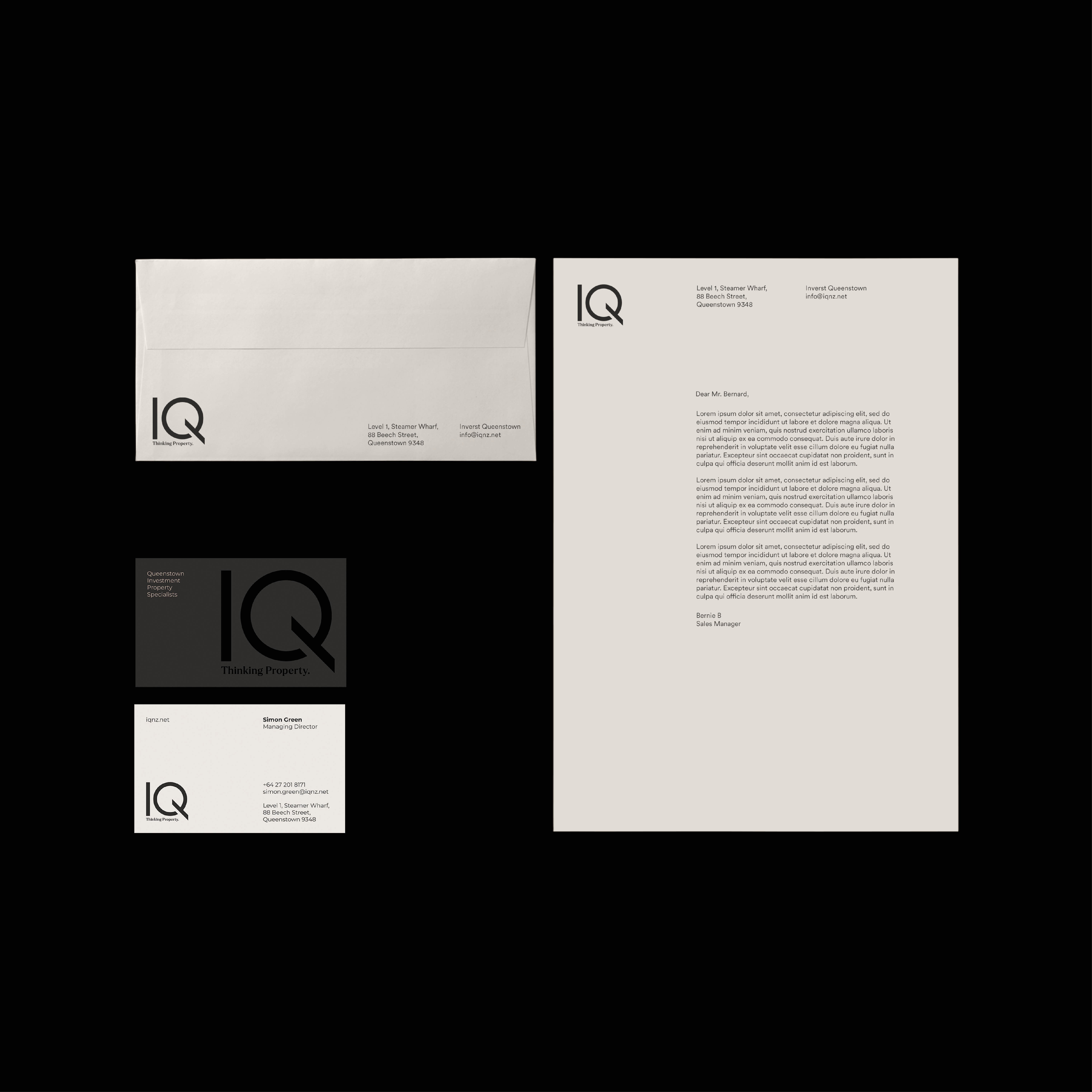
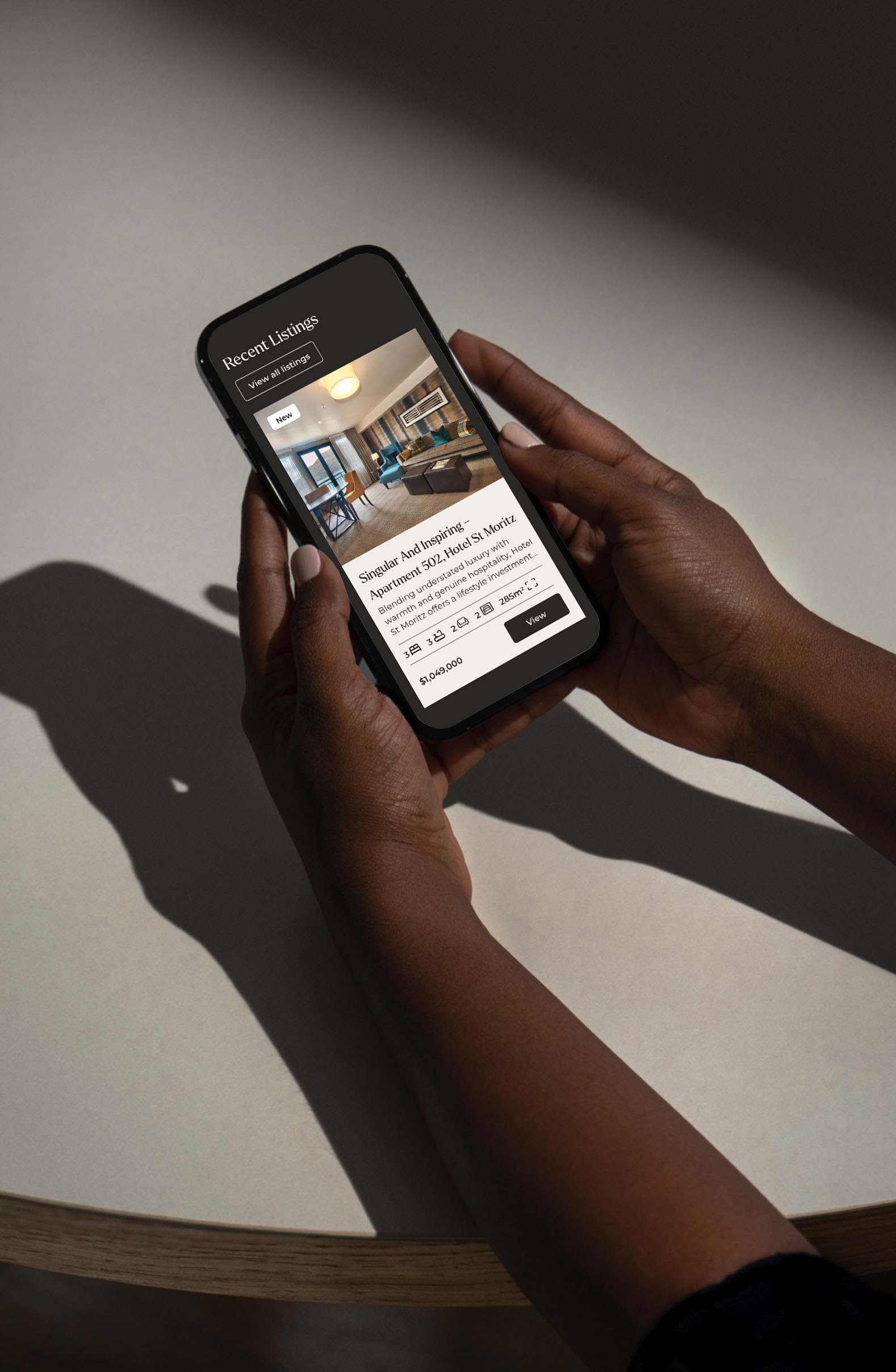
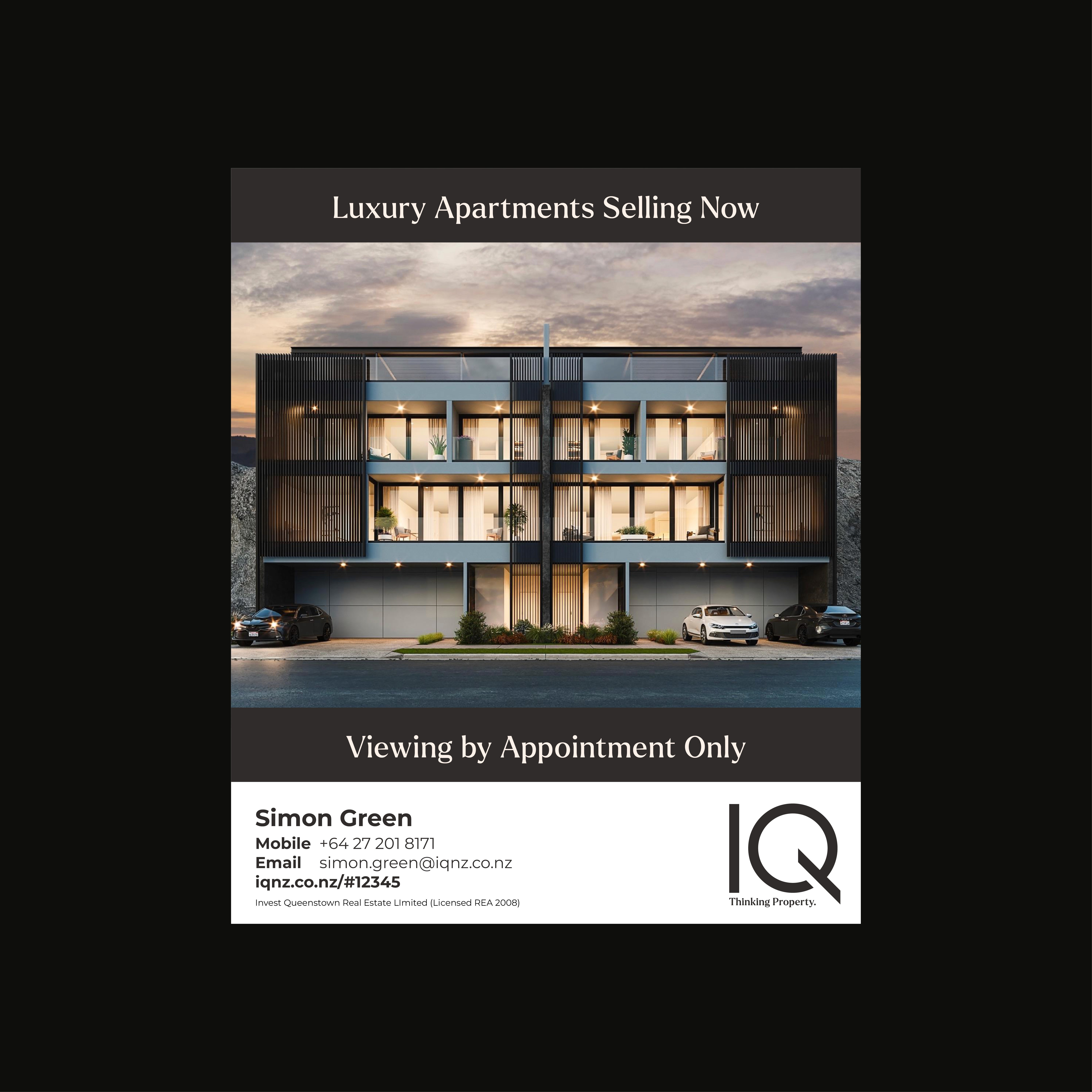
Invest Queenstown sells luxury apartments and lifestyle investments in one of New Zealand's most aspirational locations. But their brand wasn't keeping pace with the properties they were selling. In a market where a buyer's first impression often happens on a screen — before they've seen the view, smelled the mountain air, or stood on the terrace — a brand that doesn't signal premium immediately is a brand that loses the sale. I led the full creative direction across the identity refresh, website, and collateral redesign. The brief was deceptively simple: make it feel as premium as the product. In practice, that meant stripping out everything that diluted that signal. Every typographic decision, every colour choice, every piece of print collateral was pressure-tested against one question: does this communicate luxury, trust, and authority without having to say so? The result was a brand system that could hold its own against international luxury property competitors — refined enough for the top end, with enough warmth to reflect the character of the region. The client praised the elevated brand feel and returned for ongoing collateral and digital support, which is the outcome that matters most: a client who trusts you enough to keep coming back.
IQNZ_01
IQNZ_02

IQNZ_03
IQNZ_04
IQNZ_05
IQNZ_06
IQNZ_07
IQNZ_08
IQNZ_09
IQNZ_10
Invest Queenstown
,
Brand
,
2024
Invest Queenstown sells luxury apartments and lifestyle investments in one of New Zealand's most aspirational locations. But their brand wasn't keeping pace with the properties they were selling. In a market where a buyer's first impression often happens on a screen — before they've seen the view, smelled the mountain air, or stood on the terrace — a brand that doesn't signal premium immediately is a brand that loses the sale. I led the full creative direction across the identity refresh, website, and collateral redesign. The brief was deceptively simple: make it feel as premium as the product. In practice, that meant stripping out everything that diluted that signal. Every typographic decision, every colour choice, every piece of print collateral was pressure-tested against one question: does this communicate luxury, trust, and authority without having to say so? The result was a brand system that could hold its own against international luxury property competitors — refined enough for the top end, with enough warmth to reflect the character of the region. The client praised the elevated brand feel and returned for ongoing collateral and digital support, which is the outcome that matters most: a client who trusts you enough to keep coming back.
IQNZ_01
IQNZ_02
IQNZ_03
IQNZ_04
IQNZ_05
IQNZ_06
IQNZ_07
IQNZ_08
IQNZ_09
IQNZ_10
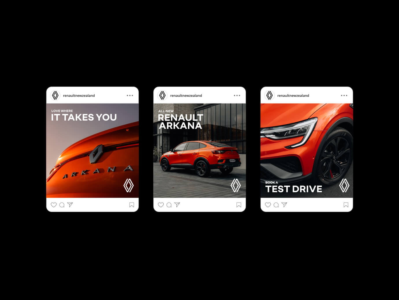
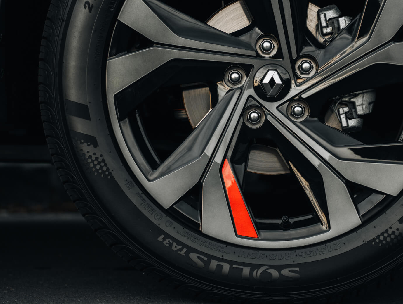
Renault Arkana
,
Advertising
,
2023
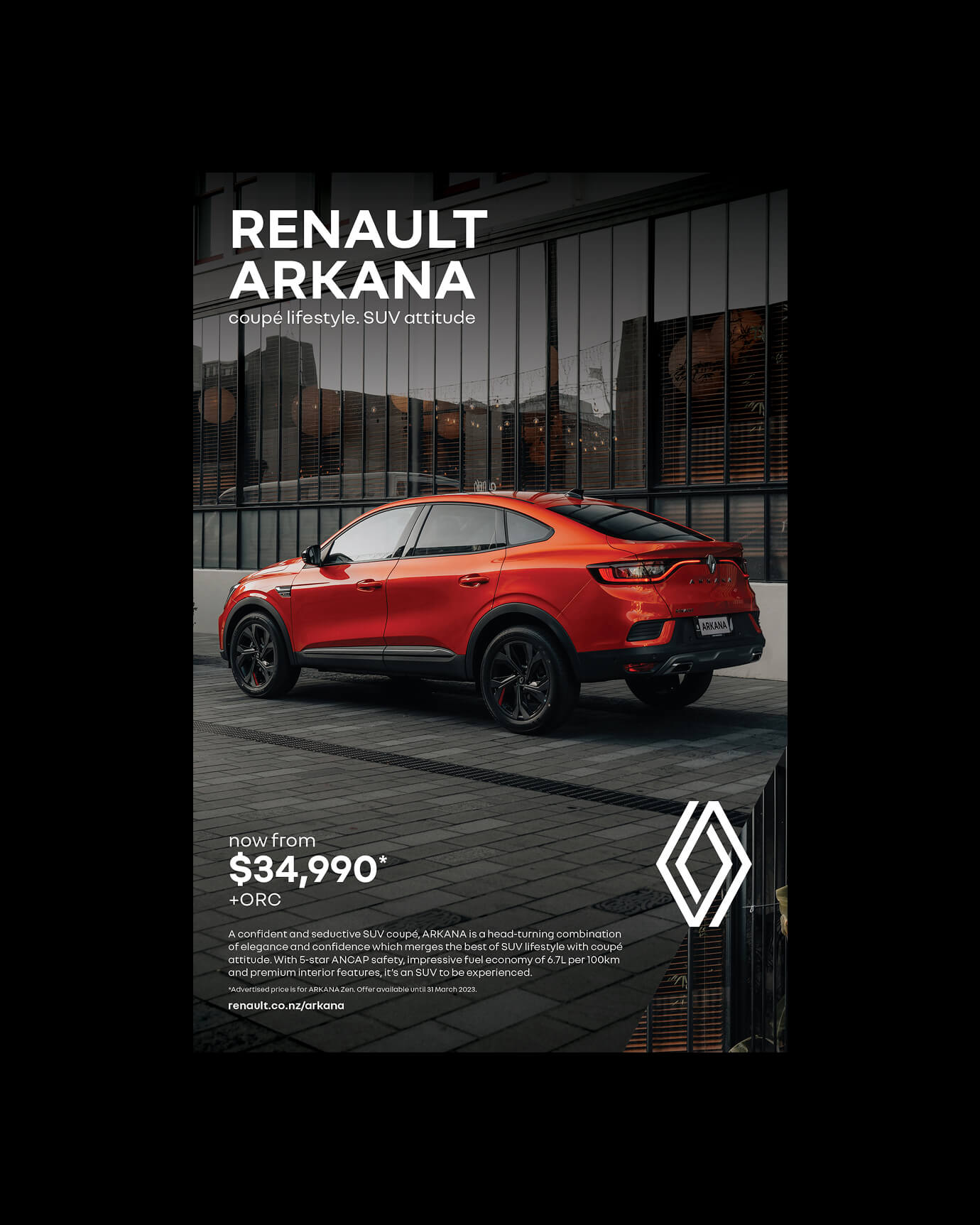
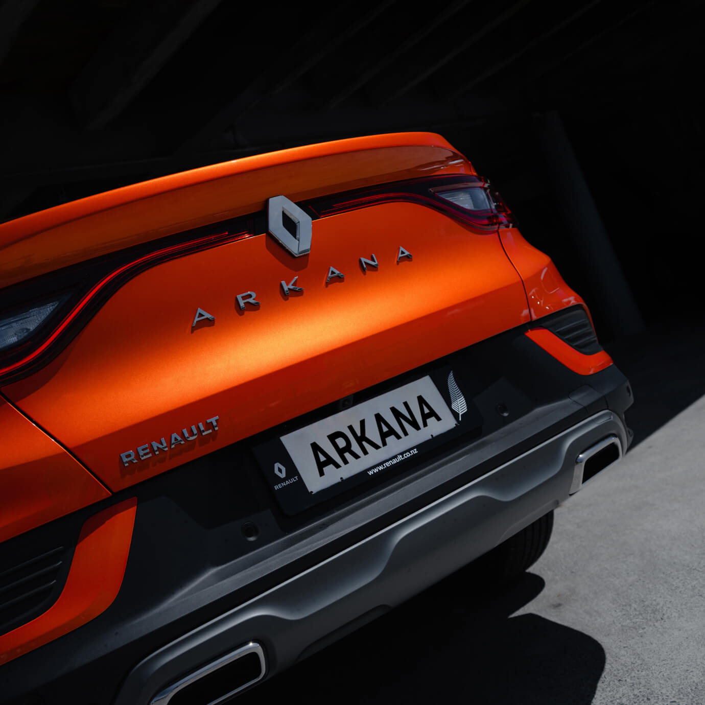
The Arkana is a difficult brief in the best possible way. Part coupé, part SUV — a car that doesn't sit comfortably in either box, and doesn't want to. When Renault New Zealand brought it to market in 2023, the risk was defaulting to the visual language of every other SUV launch: landscapes, lifestyle photography, generic confidence. That would have been exactly wrong. I led the creative design direction across a 360° launch campaign, working alongside copywriters and production partners on different deliverables. My responsibility covered the visual identity of the campaign across press and digital advertising, print collateral, showroom and event environments, social content, and website — ensuring every format carried the same attitude. The Arkana's design is seductive and a little subversive, and the creative needed to earn that quality rather than just assert it. The campaign launched nationally and performed well in-market — a full-channel execution that positioned the Arkana not as another SUV, but as a distinct design choice for buyers who want something with more conviction. The client continued working with us on subsequent model activity, which is the result that tells you the campaign landed.
RENAULT_MOTION

RENAULT_02

RENAULT_03
RENAULT_04
RENAULT_05

RENAULT_06
RENAULT_07

RENAULT_08
RENAULT_09
RENAULT_10
Renault Arkana
,
Advertising
,
2023
The Arkana is a difficult brief in the best possible way. Part coupé, part SUV — a car that doesn't sit comfortably in either box, and doesn't want to. When Renault New Zealand brought it to market in 2023, the risk was defaulting to the visual language of every other SUV launch: landscapes, lifestyle photography, generic confidence. That would have been exactly wrong. I led the creative design direction across a 360° launch campaign, working alongside copywriters and production partners on different deliverables. My responsibility covered the visual identity of the campaign across press and digital advertising, print collateral, showroom and event environments, social content, and website — ensuring every format carried the same attitude. The Arkana's design is seductive and a little subversive, and the creative needed to earn that quality rather than just assert it. The campaign launched nationally and performed well in-market — a full-channel execution that positioned the Arkana not as another SUV, but as a distinct design choice for buyers who want something with more conviction. The client continued working with us on subsequent model activity, which is the result that tells you the campaign landed.
RENAULT_MOTION
RENAULT_02
RENAULT_03
RENAULT_04
RENAULT_05
RENAULT_06
RENAULT_07
RENAULT_08
RENAULT_09
RENAULT_10
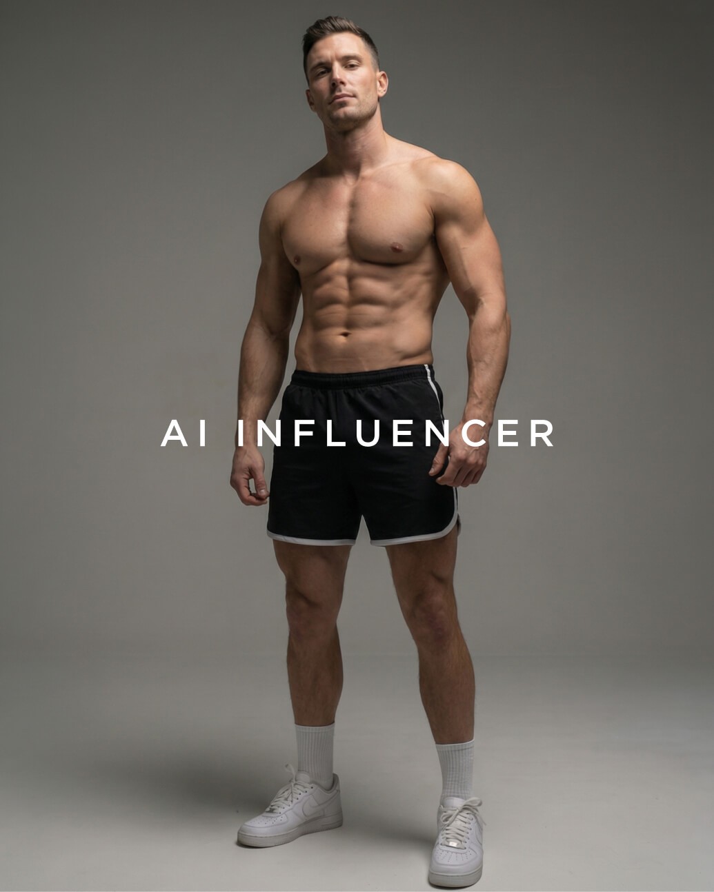
Ai Influencer
,
Ai
,
2026
Using Higgsfield, Nano Banana Pro, and Kling 3.0, I built a fully AI-generated brand ambassador from the ground up. The goal wasn't a single impressive image — it was a consistent, believable character who could hold up across radically different content formats: TVC, podcast, UGC, fashion photography. The same face, the same skin texture, the same presence, in every format a brand actually uses. The experiment surfaced real implications for how agencies think about production, casting, and scalable content. A consistent AI-generated character doesn't replace creative direction — it demands more of it. You can't rely on a real person's natural charisma to carry the work. Every detail of the character has to be designed. This project is about understanding what's coming before it arrives, and building the craft to use it well when it does.
Ai_01

Character Sheet_02
Studio photography_03
TVC_04
Ai_05
Podcast_06
UGC_07

Fashion photography_08
Ai Influencer
,
Ai
,
2026
Using Higgsfield, Nano Banana Pro, and Kling 3.0, I built a fully AI-generated brand ambassador from the ground up. The goal wasn't a single impressive image — it was a consistent, believable character who could hold up across radically different content formats: TVC, podcast, UGC, fashion photography. The same face, the same skin texture, the same presence, in every format a brand actually uses. The experiment surfaced real implications for how agencies think about production, casting, and scalable content. A consistent AI-generated character doesn't replace creative direction — it demands more of it. You can't rely on a real person's natural charisma to carry the work. Every detail of the character has to be designed. This project is about understanding what's coming before it arrives, and building the craft to use it well when it does.
Ai_01
Character Sheet_02
Studio photography_03
TVC_04
Ai_05
Podcast_06
UGC_07
Fashion photography_08